A playful synthesis of the arts
House near Valencia by Masquespacio

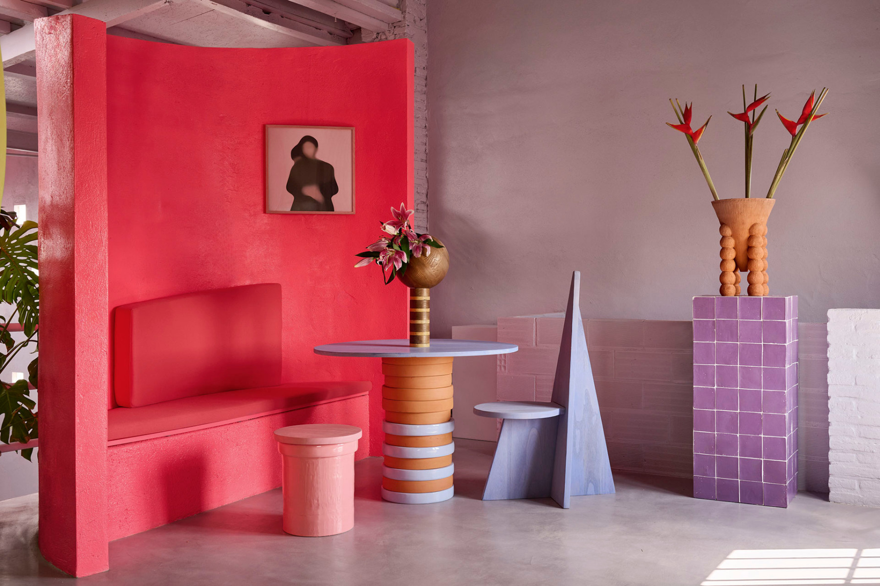
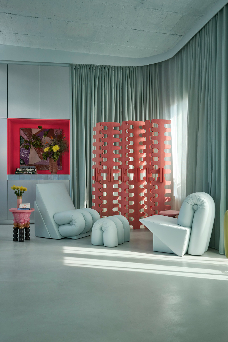
The love of geometry is also reflected in the home's furniture, which has been placed in the room like art objects. © Luis Beltran
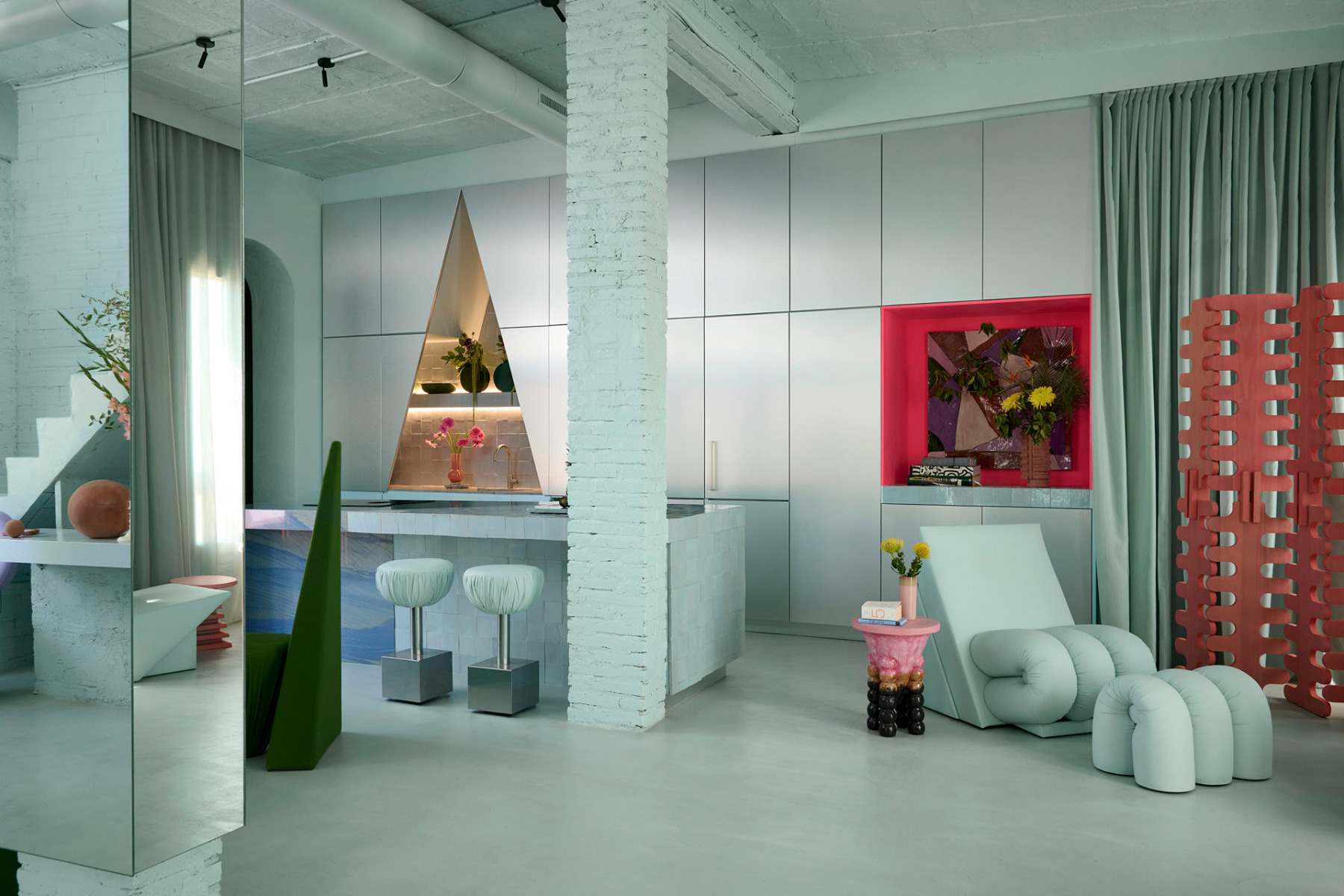
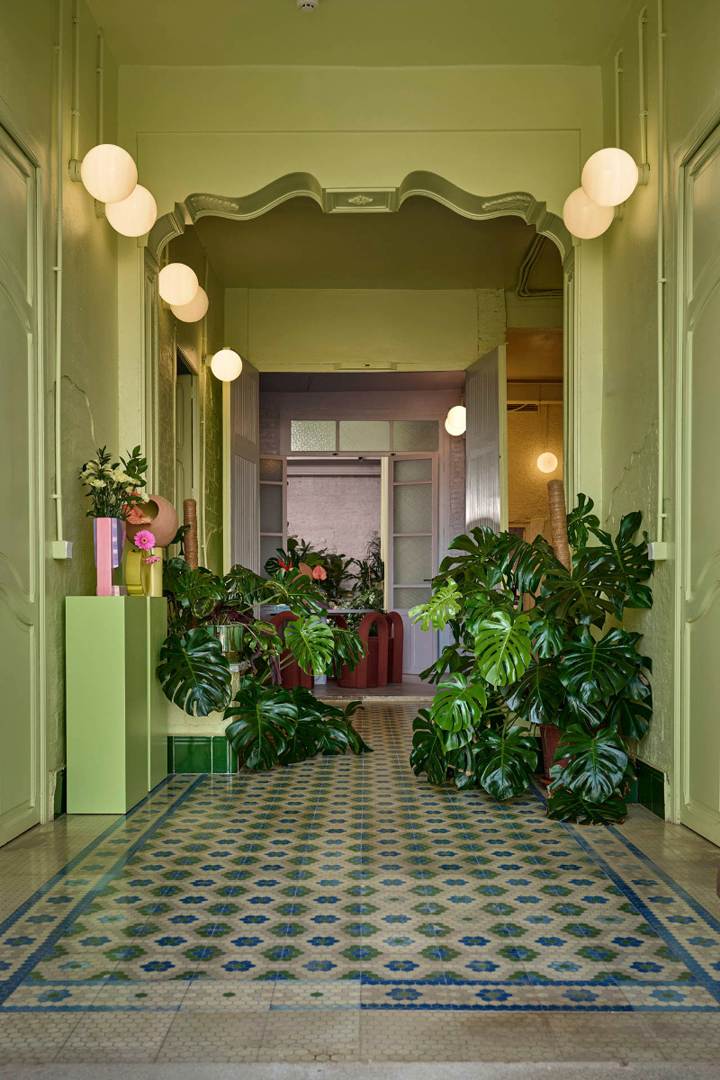
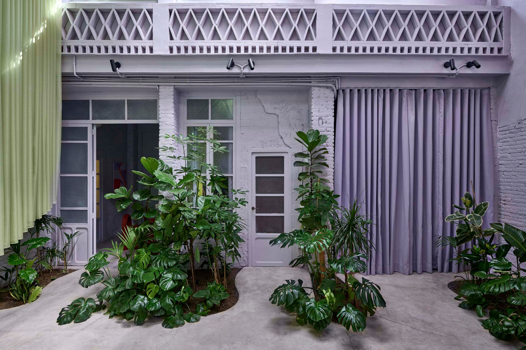
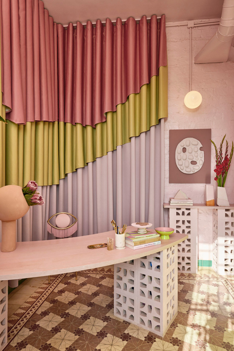
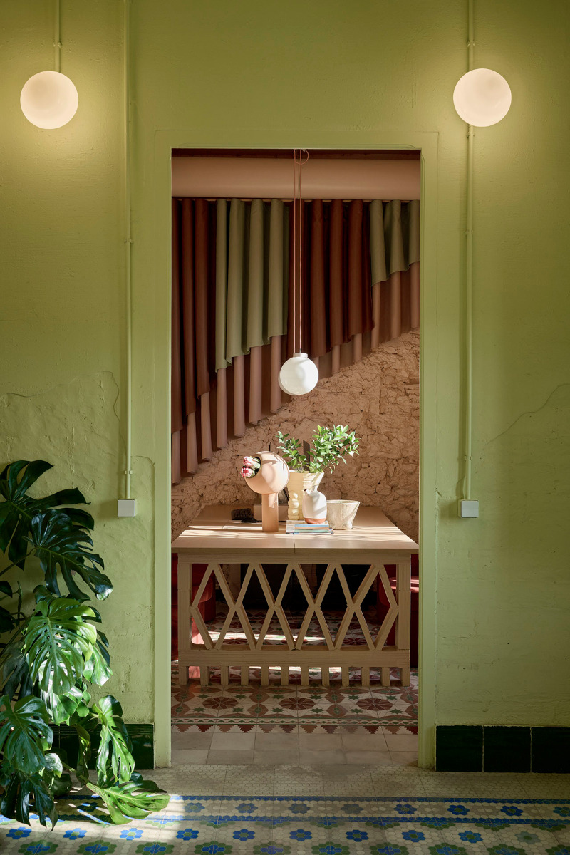
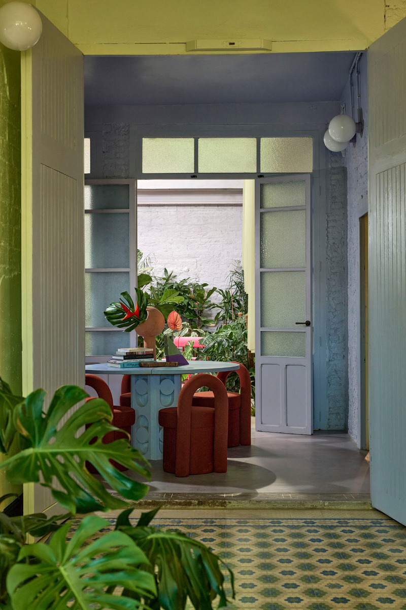
Near Valencia, Ana Milena Hernández Palacios and Christophe Penasse from Masquespacio have converted a 1925 house into an expressive living space and studio. From the outside, the house looks typical of the region, but inside, the designers have transformed it into a minimalist yet colourful structure with a total surface area of 450 m². Although the tiles and ornamentation on the walls and doors at the front of the ground floor have been retained, the striking colour scheme makes the whole space look more like a showroom. At the rear of the building and on the upper floor, there is also a screed floor, colour-painted brick walls and exposed concrete ceilings, all of which evoke associations with an art gallery.


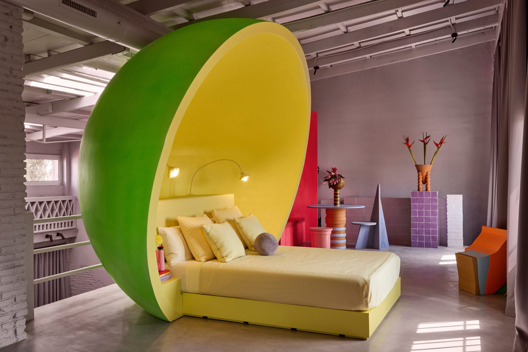
The bed is covered with a hemisphere. © Luis Beltran
A love of geometry
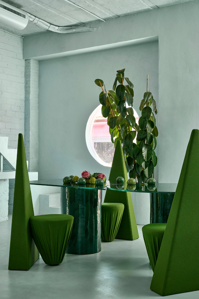
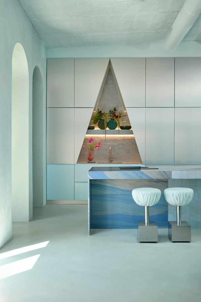
The effect is accentuated by Masquespacio's interventions, such as round windows and triangular openings in the walls. The love of geometry is also reflected in the furniture, which is placed in the room as if it were an object of art. Examples include the hemisphere-covered bed and the semicircular seating area next to it.
Open space concept
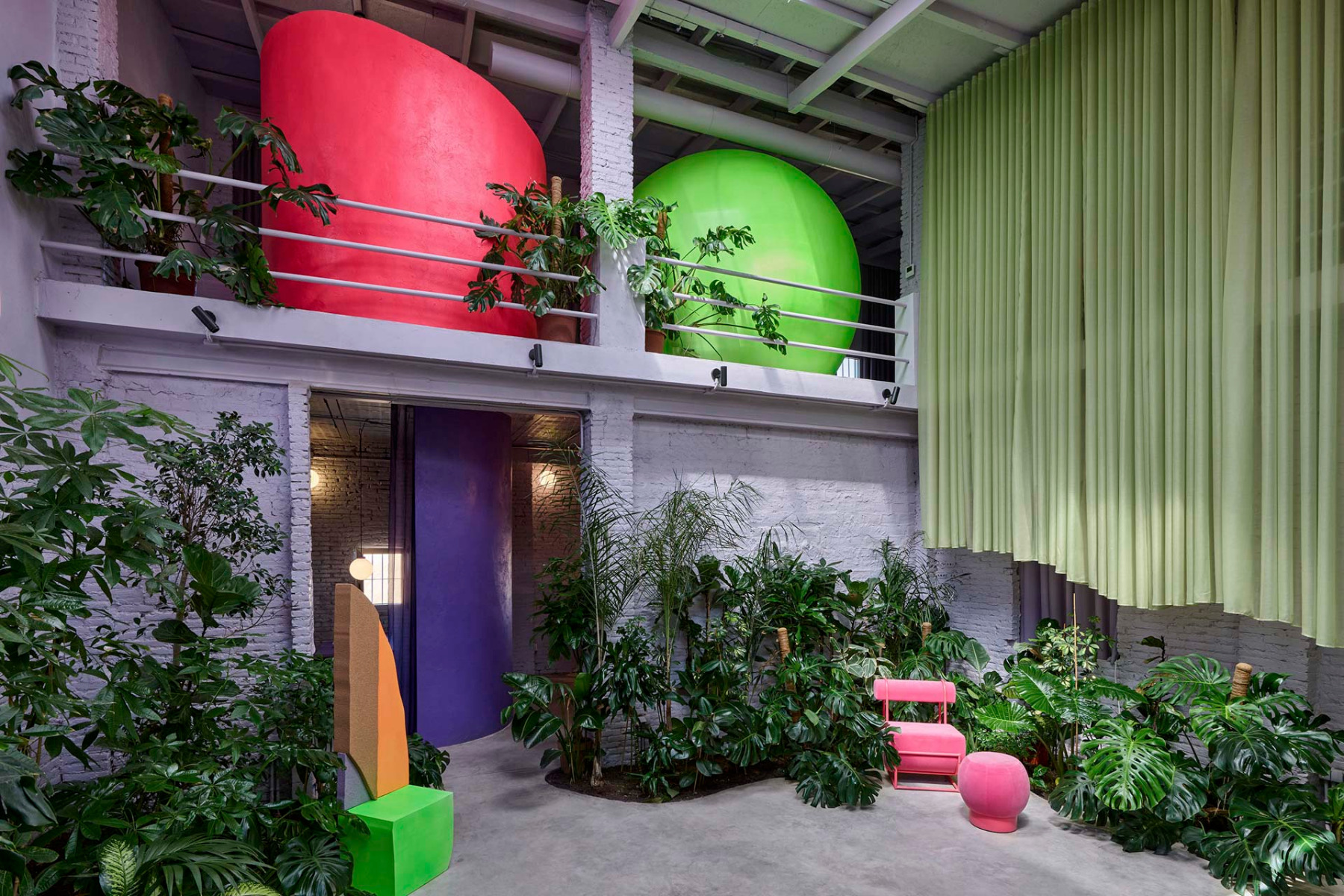
While the ground floor is primarily used for work, the living area is on the floor above. The atrium, with its skylight, acts as a connecting element to which the individual areas open up. A violet staircase leads to the upper floor with living room, kitchen, roof terrace, bathroom and storage.


With its bold colours, the structure of the room is more reminiscent of a showroom. © Luis Beltran
Living with colour
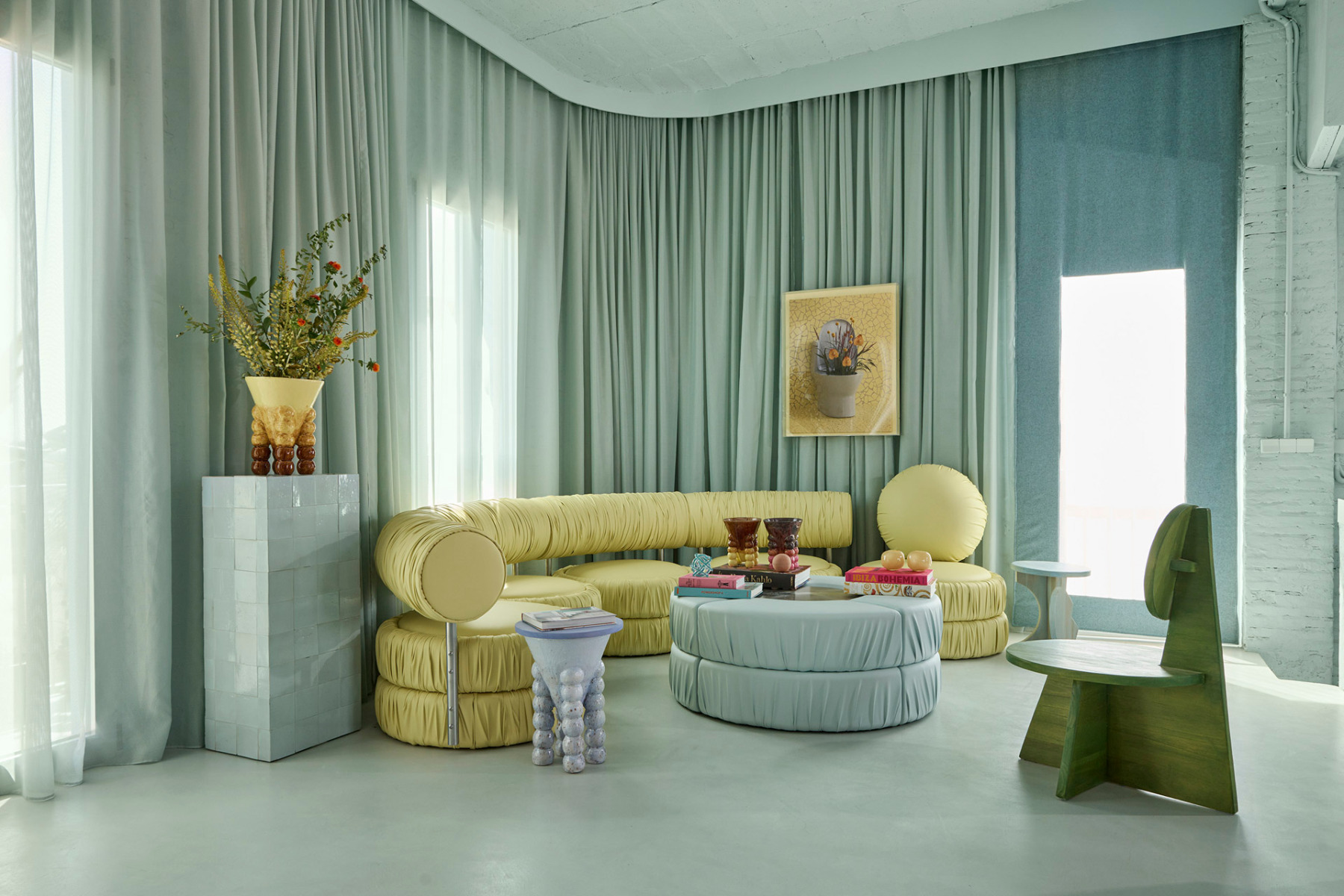
The colourful furniture, also designed by Masquespacio, is placed loosely yet precisely in the open spaces. Textures, shapes, materials and colours combine to create a work of art that reflects the duo's approach to design, oscillating between playful post-modernism and hard brutalism. More subtle nuances are provided by curtains, which can be used, for example, to separate the living spaces from the atrium.


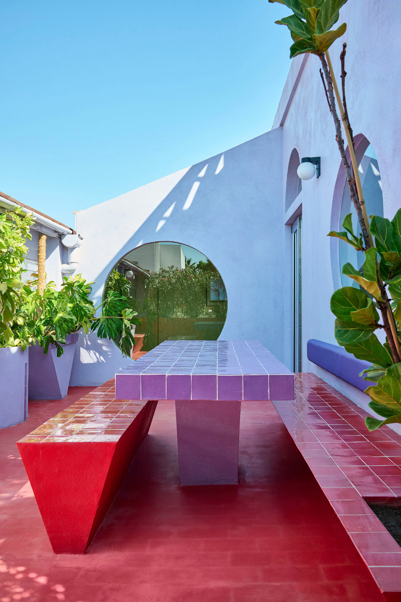
The omnipresent power of colour can also be seen on the terrace. © Luis Beltran


In the front part of the ground floor, the tiles and ornaments on the walls and doors have been preserved. © Luis Beltran
Zoning with colour
The ubiquitous power of colour is not only the creative will of the designers, but also serves a functional purpose. For example, green is used for the dining area and yellow for the sofa corner. The hallway, which separates the living area from the bedroom, is also green. A circular window offers a view of the roof terrace in shades of red and blue, which contributes to the overall composition of the house.
Architecture: Masquespacio
Client: Masquespacio
Location: Surrounding area Valencia (ES)


