Tailor-made: House Bäumle in Vorarlberg

Photo: Adolf Bereuter
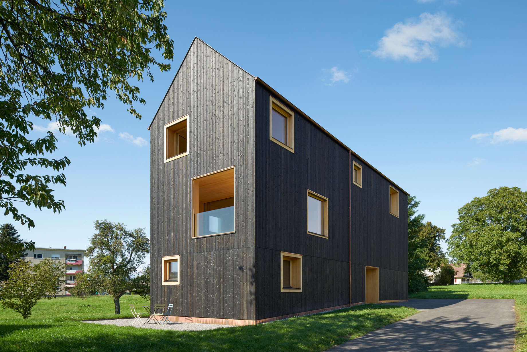
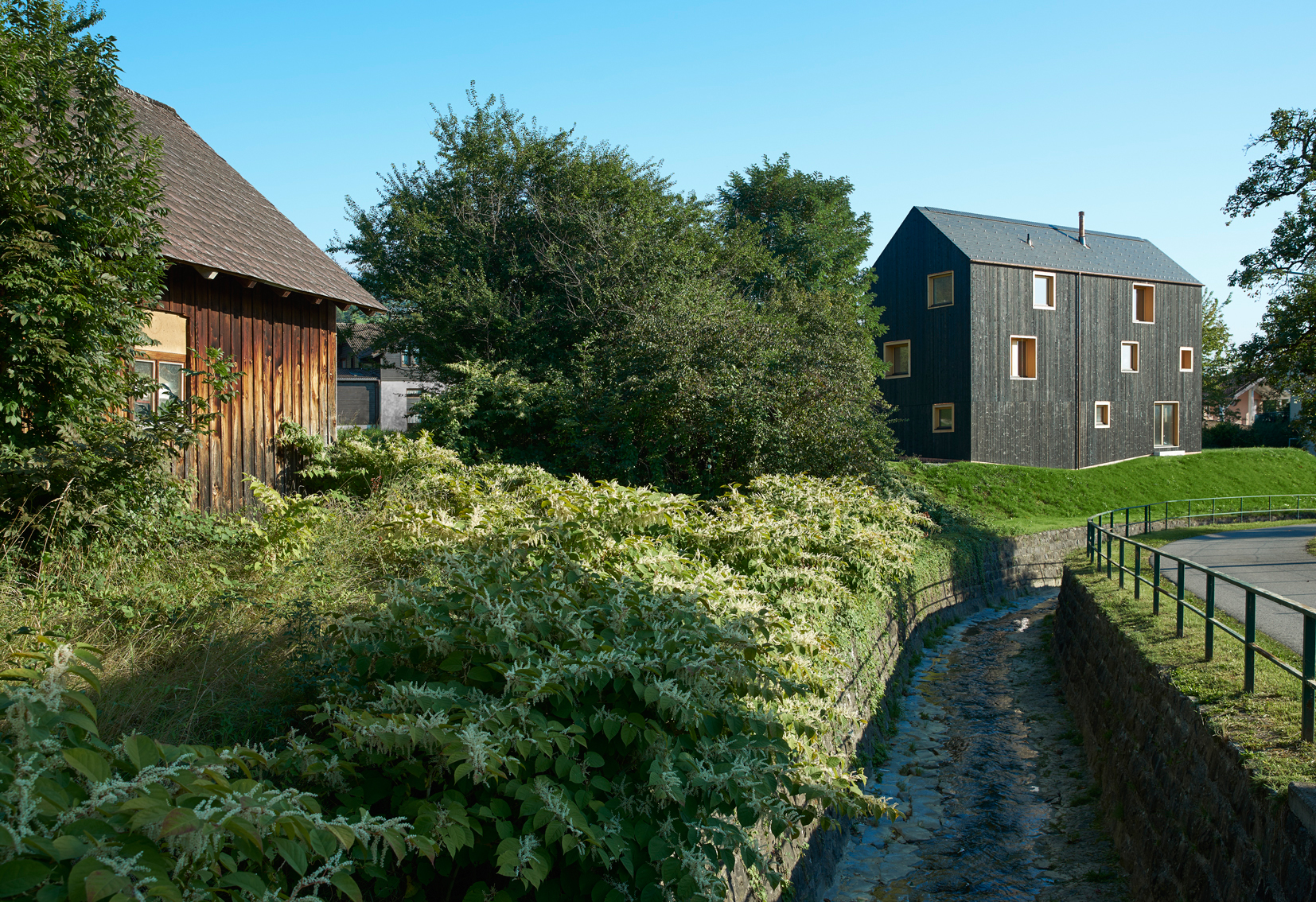
Designed by Bernardo Bader Architects, House Bäumle, a single household home in Lochau, Austria, underscores how it is possible to create attractive living and working quarters even on challenging plots. The building's interior articulation, involving closed-off rooms and more open and accessible ones, is a particularly interesting feature.
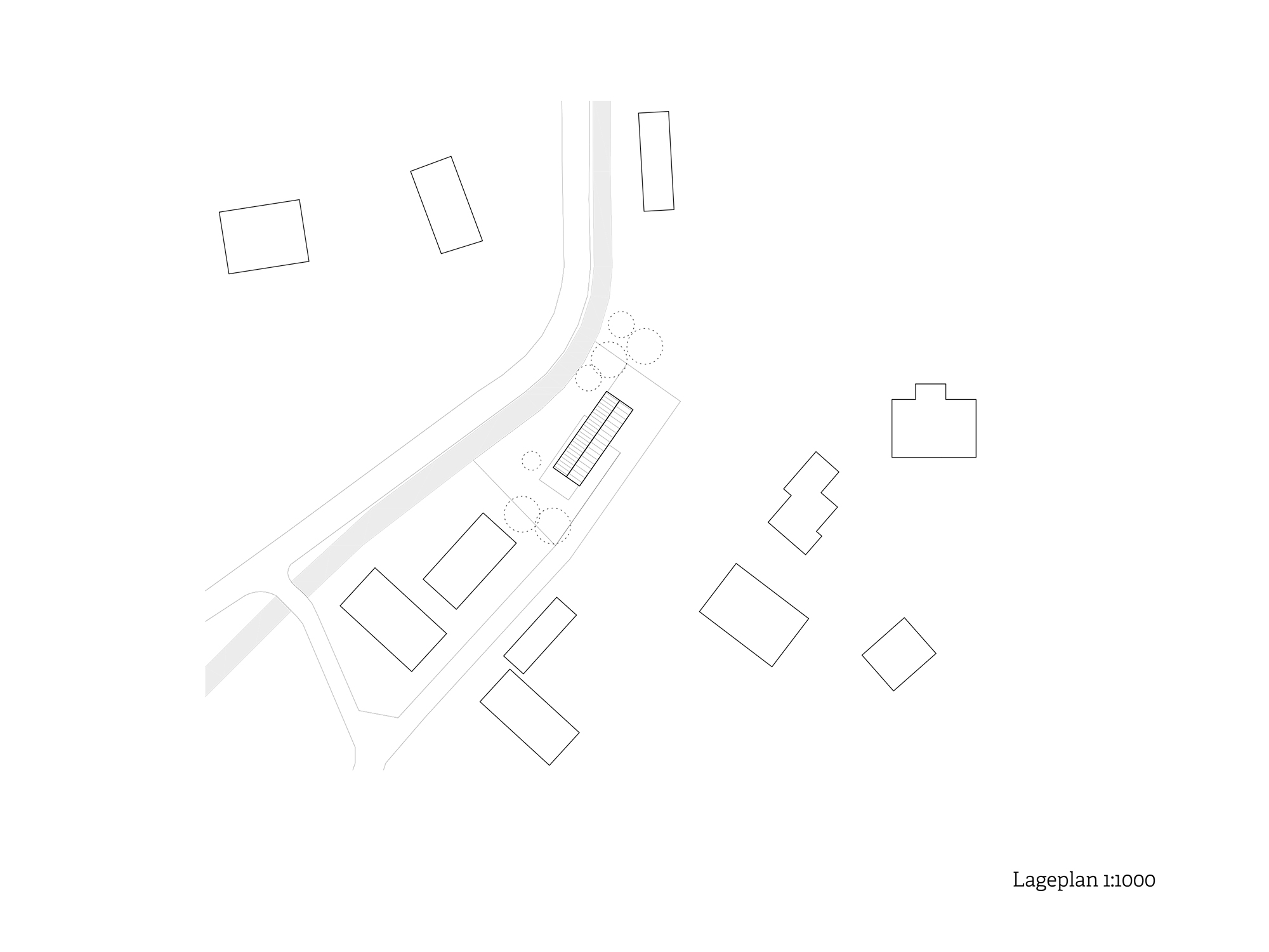
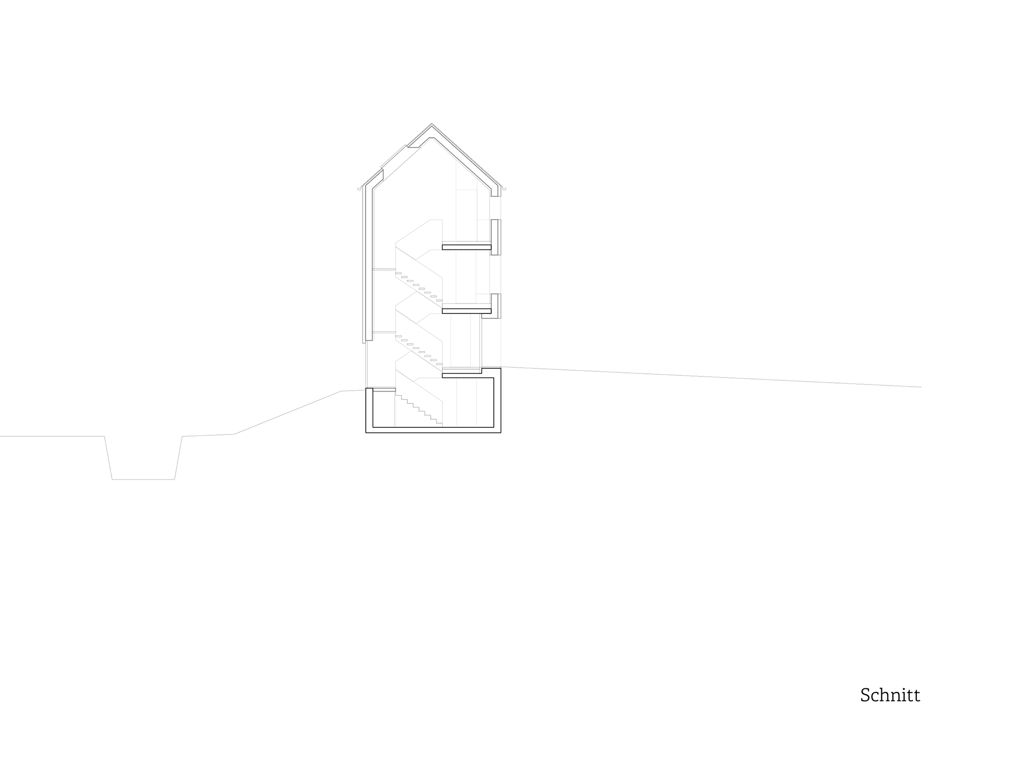
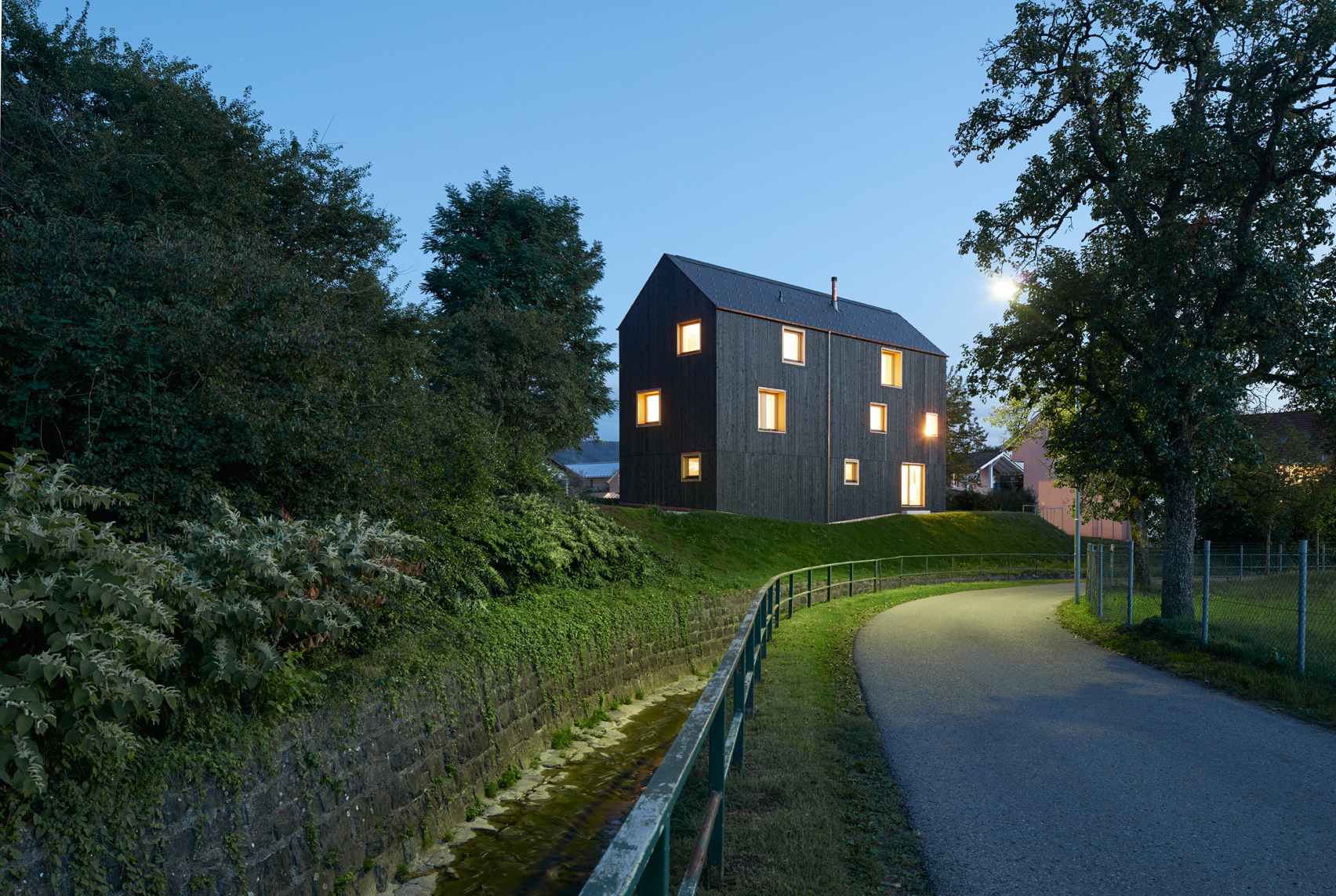
At first the property – a long and narrow strip of land that suddenly falls away to a stream on the northern side – does not seem to an easy one for building on due to its shape and uneven topography. Access is provided from the southern side, where a road passes by the very edge of the plot.
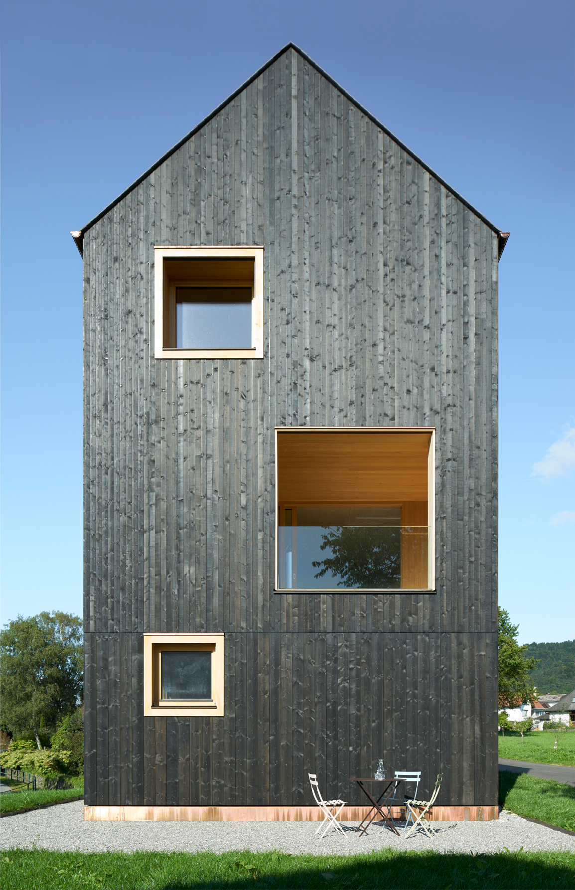
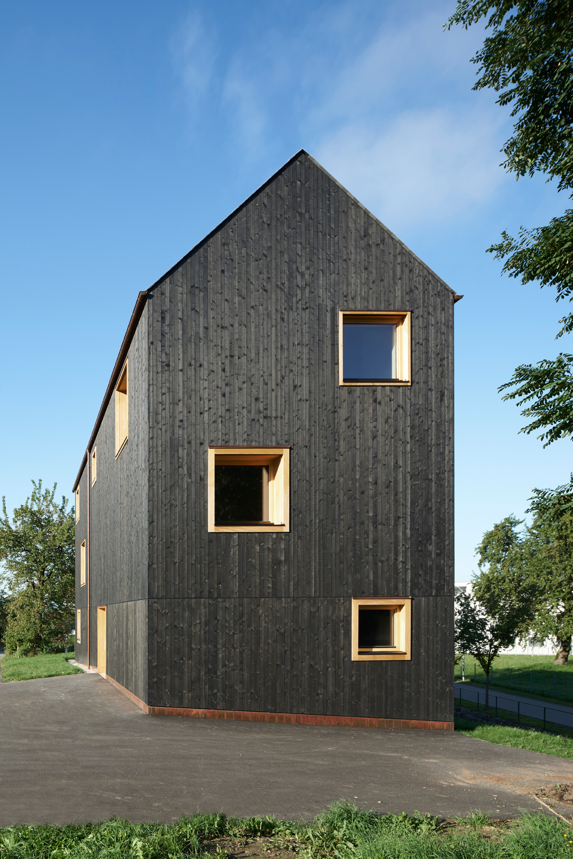
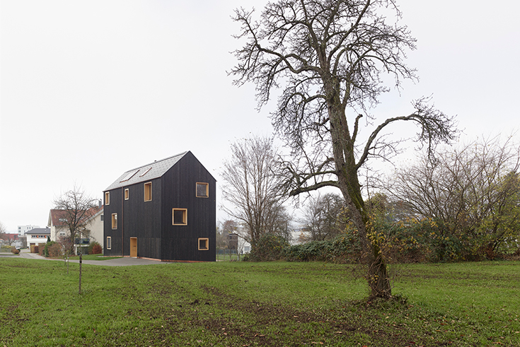
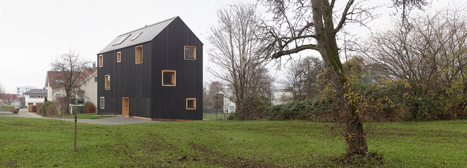
To make the most of the construction site, the rectangular footprint of the building continues upwards into a total of three storeys. The plain volume has a homogenous outer skin with absolutely no projections or similar. The resulting impression of introversion is underscored by the colour of the façade in vertical timber battens; executed in black, it means the building cannot be overseen. The plain and uniform look is solely interrupted by window openings with lighter-toned wooden frames that give them a staged and deliberate look. The building is topped by a simple ridged roof with a dark covering in keeping with the sombre colour of the outer walls. Overhanging eaves have been dispensed with, meaning that the roof and walls meet in almost seamless fashion. This makes the building seem higher than it is, lending it greater presence despite the relatively small size of the building plot.
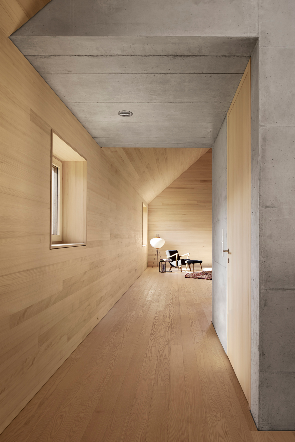
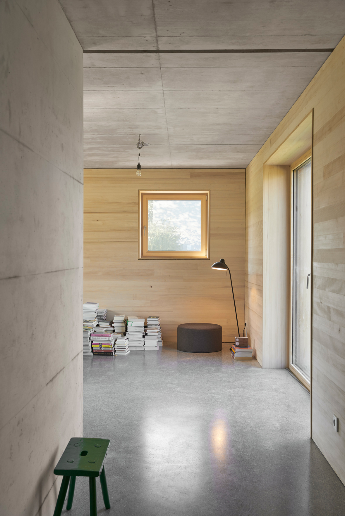
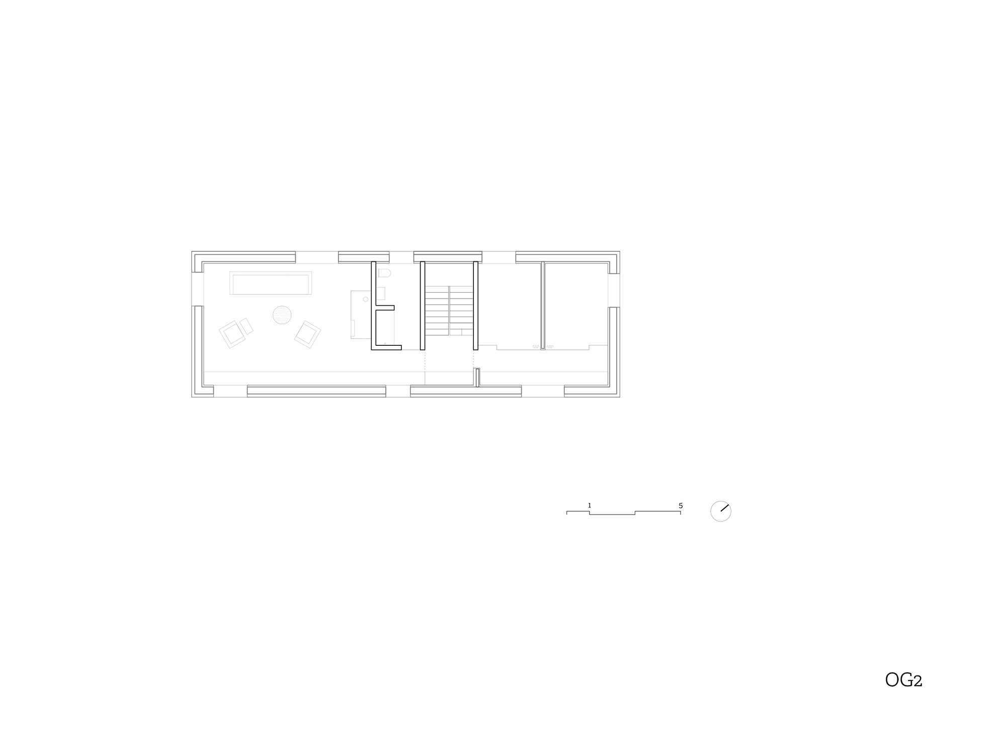
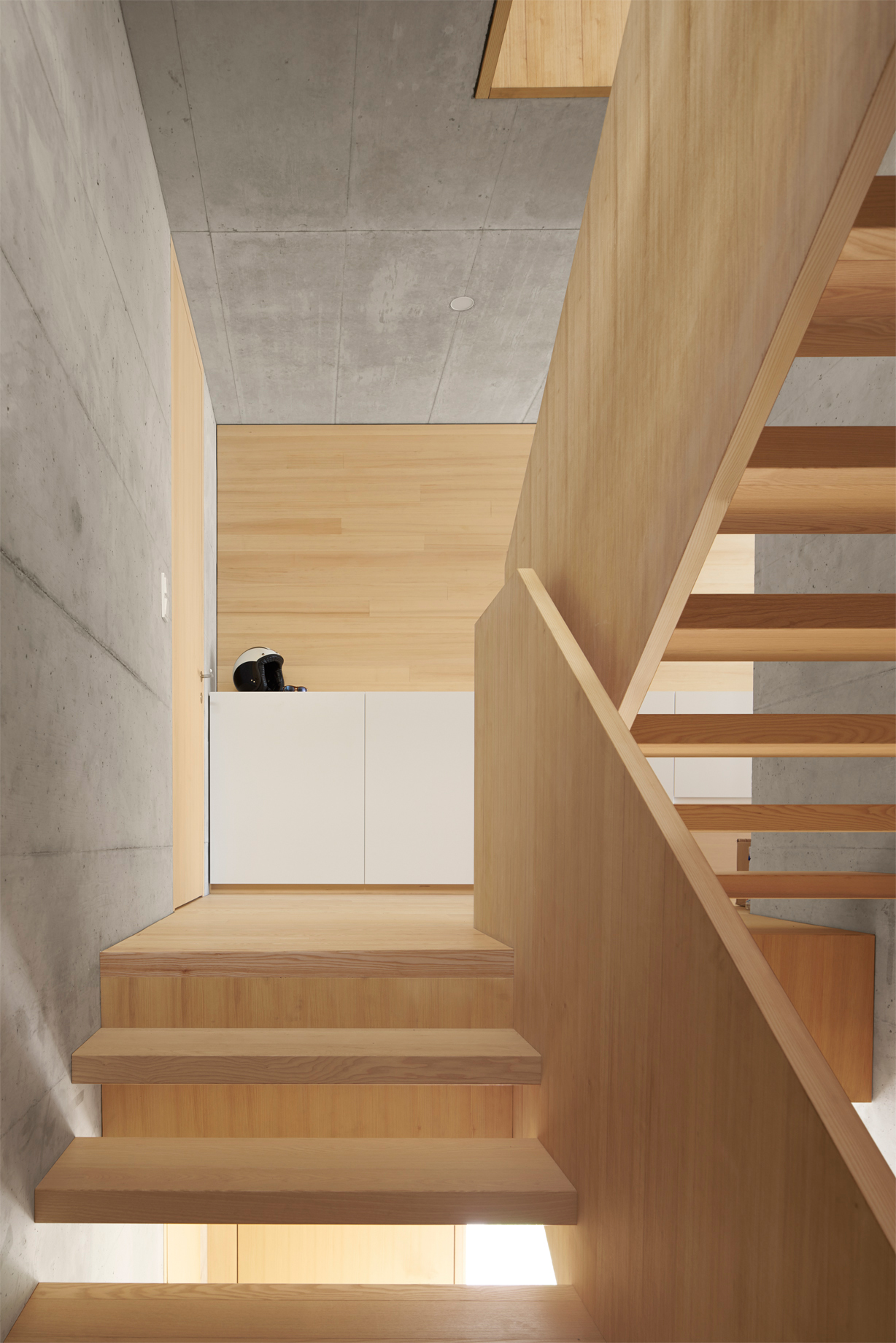
Indoors the more private rooms are grouped towards the middle but open up increasingly to the exterior – a concept that is reflected in the use of a massive concrete core complemented with timber. Darker and lighter zones are the intentional result. The understated window openings ensure necessary visual privacy and provide strategically positioned views onto the outdoors.
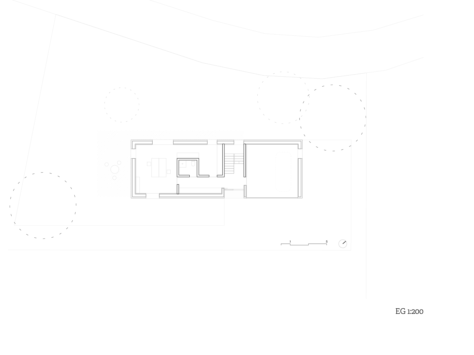
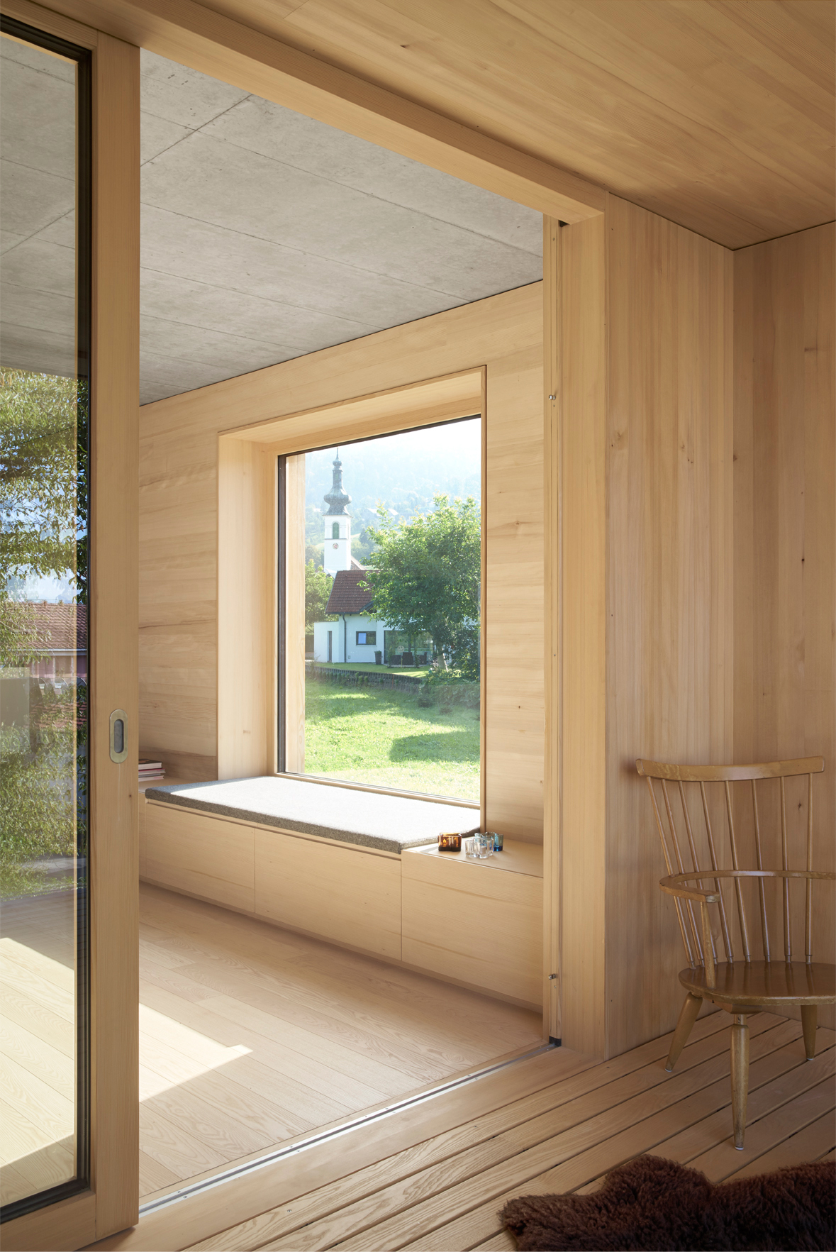
The room programme comprises a studio on the ground floor, a spaciously proportioned cooking and dining area on the first floor, complete with a loggia, and a lounge and fireplace room on the second floor. Use has been made of warm but sober materials, such as pale wood that corresponds with features in white and the fair-faced concrete walls positioned at chosen places. In other places, the outer skin and the interior seem to literally merge into one, as in the kitchen area, where a window reveal continues on into a bench.
The building is an object lesson in how complex circumstances do not need to be a disadvantage but can give rise to extremely interesting spatial situations and layout solutions.
