Renovation and expansion
School in the Netherlands by MVRDV

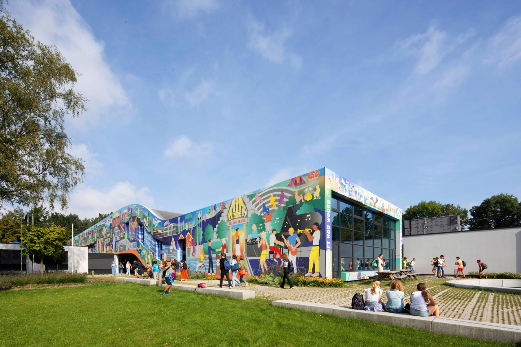
The expanded and redesigned Gymnasium Beekvliet asserts itself in all its many colours. © Daria Scagliola
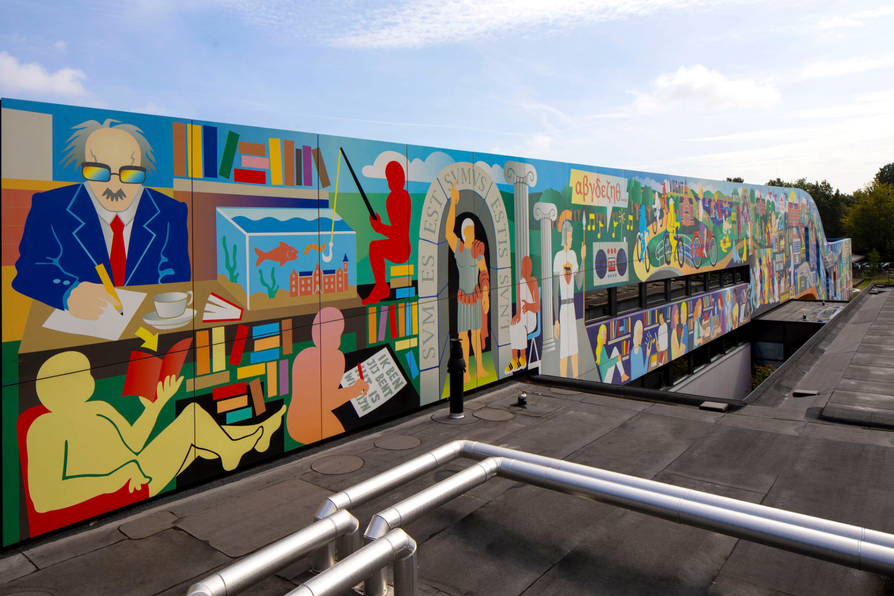
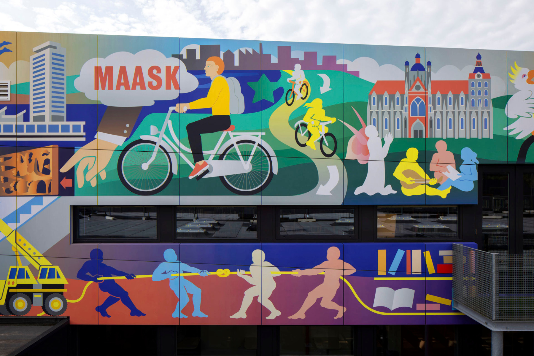
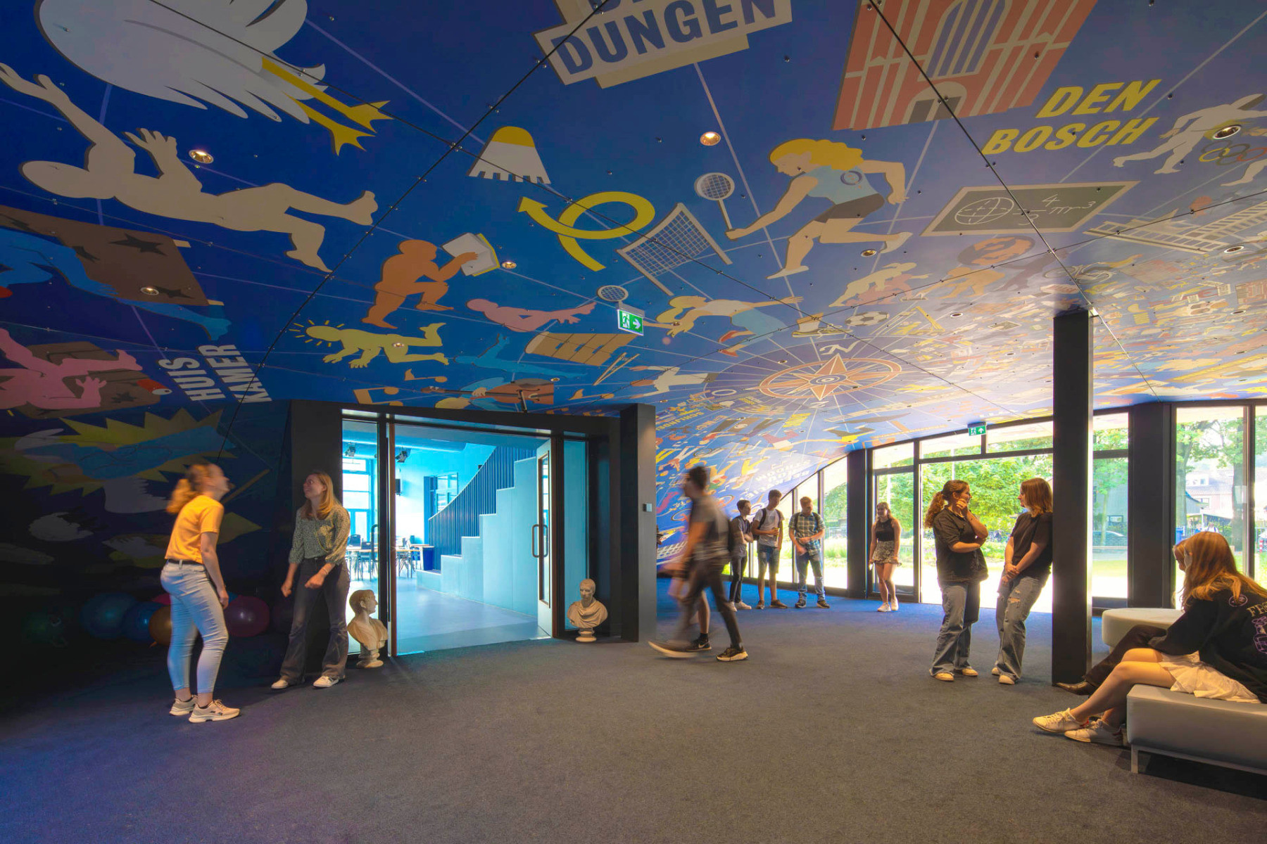
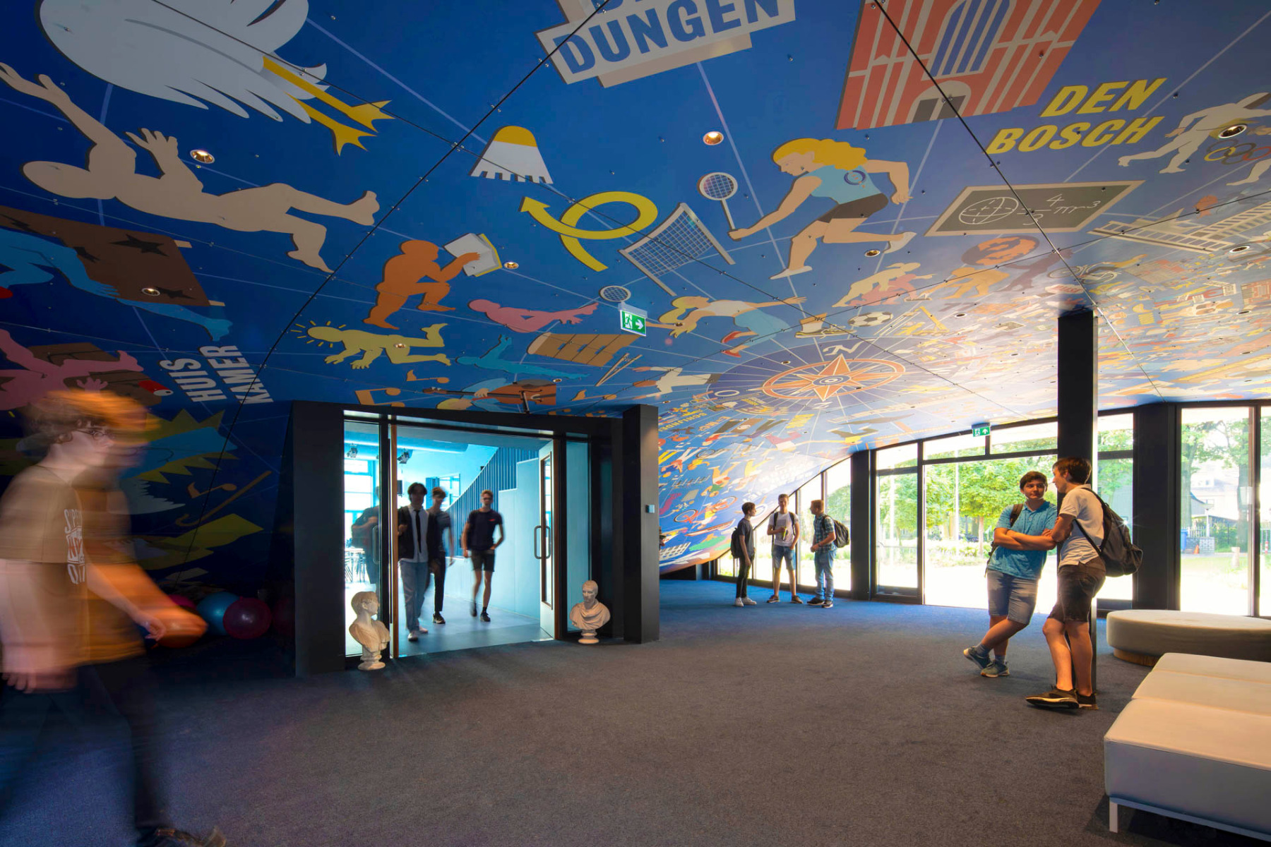
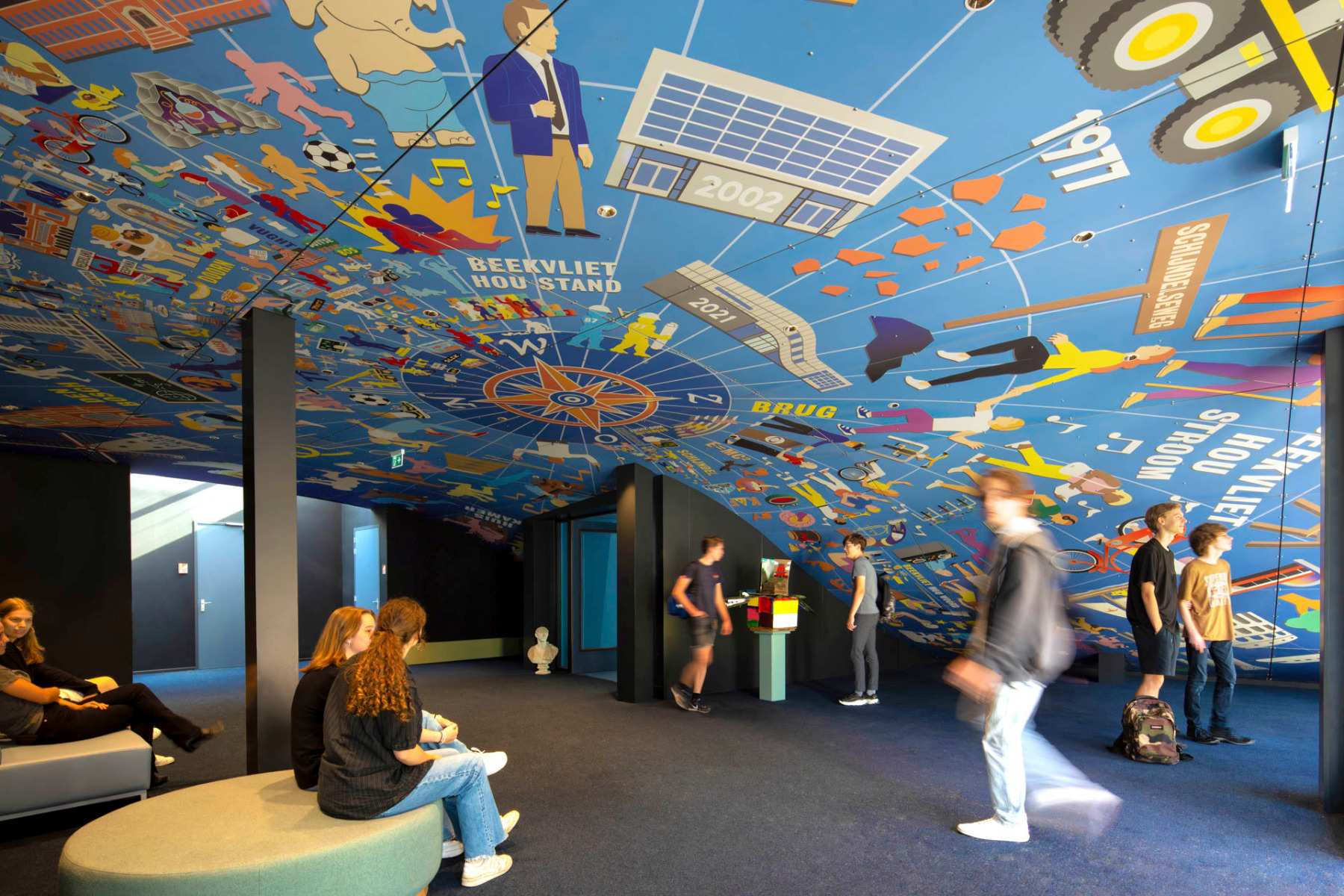
In collaboration with Van Boven Architecten, MVRDV have redesigned the Gymnasium Beekvliet. The painted walls and ceilings by artist Ian Kirkpatrick tell the story (stories) of the building and its students.


The main entrance is located in its original position, but is now beneath the curved roof. The mural tells the story of the school. © Daria Scagliola
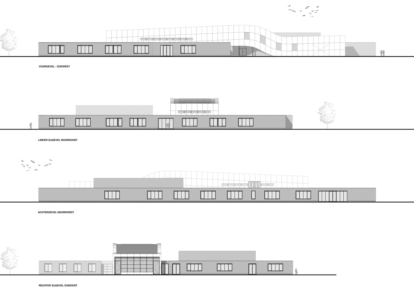
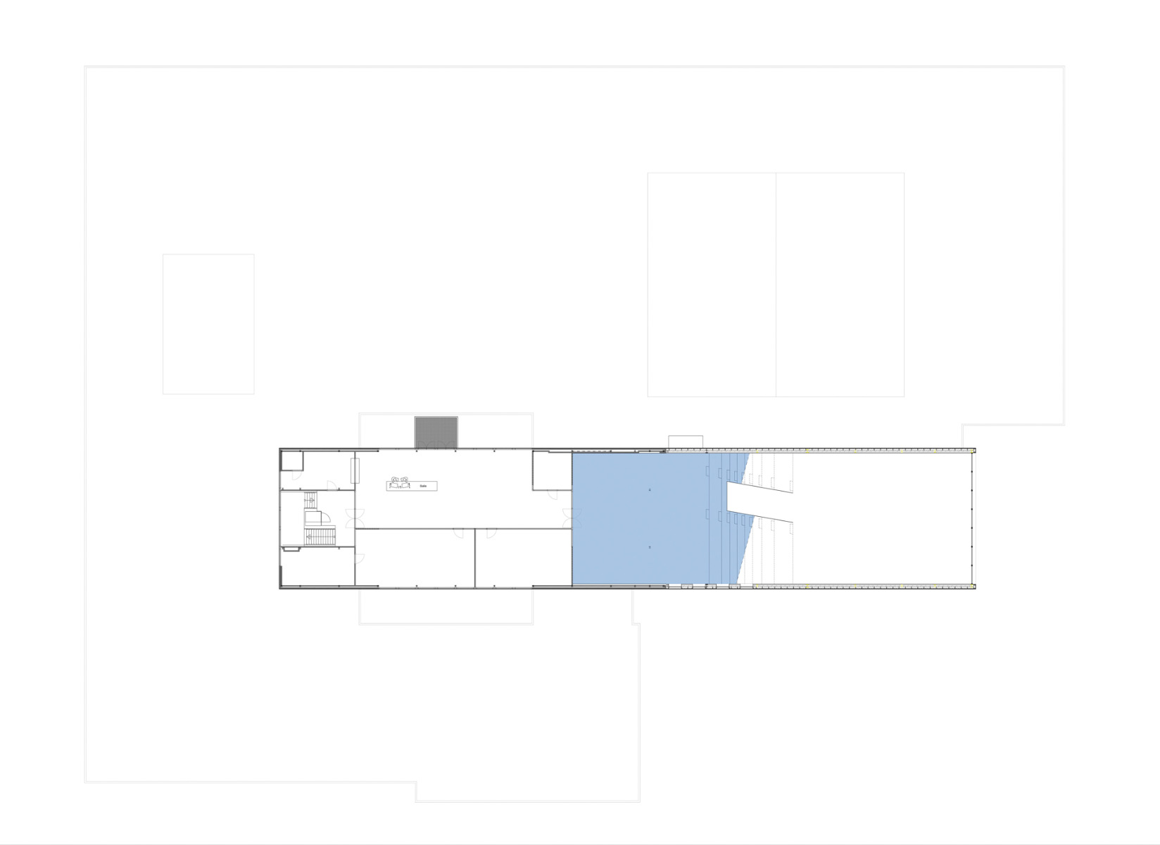
This Catholic secondary school, which is located in the community of Sint-Michielsgestel in the south of the Netherlands, looks back on 200 years of history. In 2016, MVRDV and Van Boven Architecten won the competition to renovate the building. An expansion has created space for the new auditorium and optimized the flow of movement inside the school.
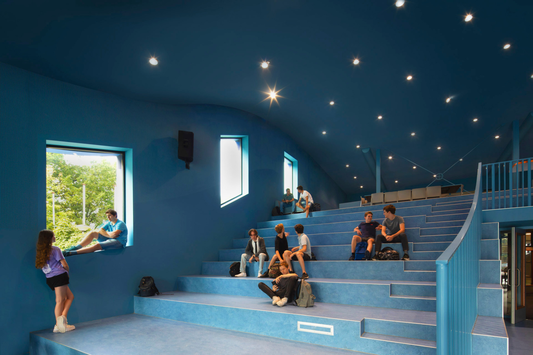
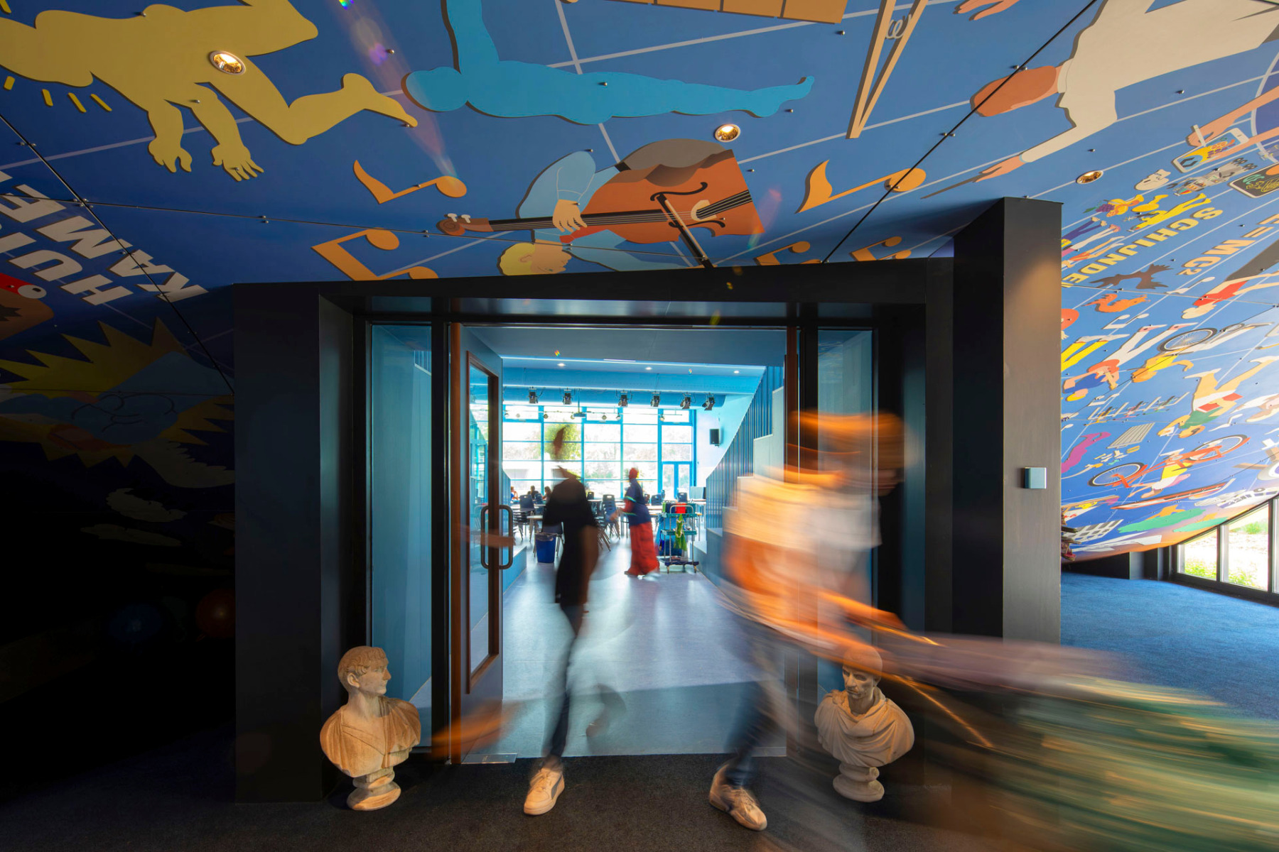
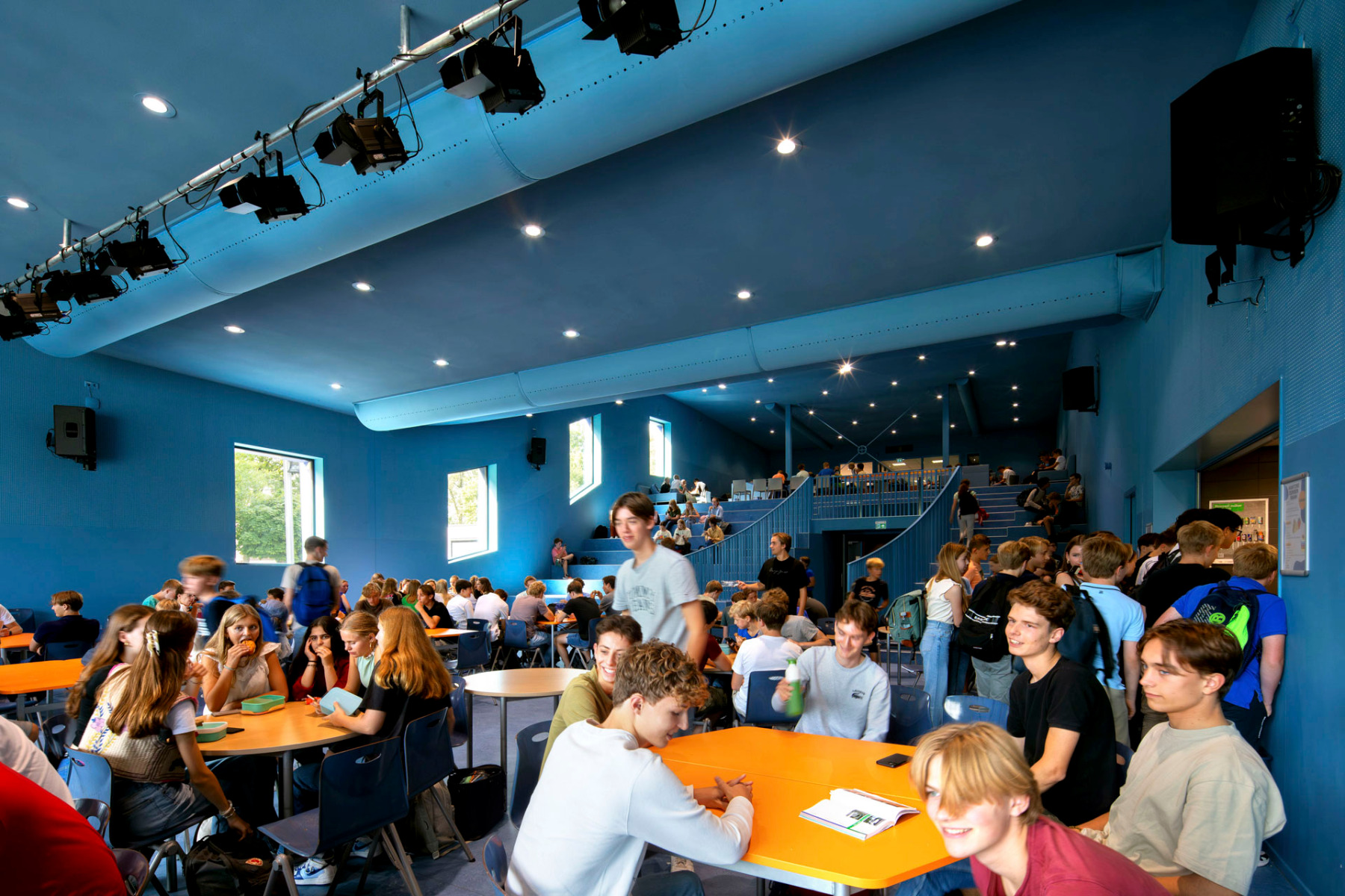
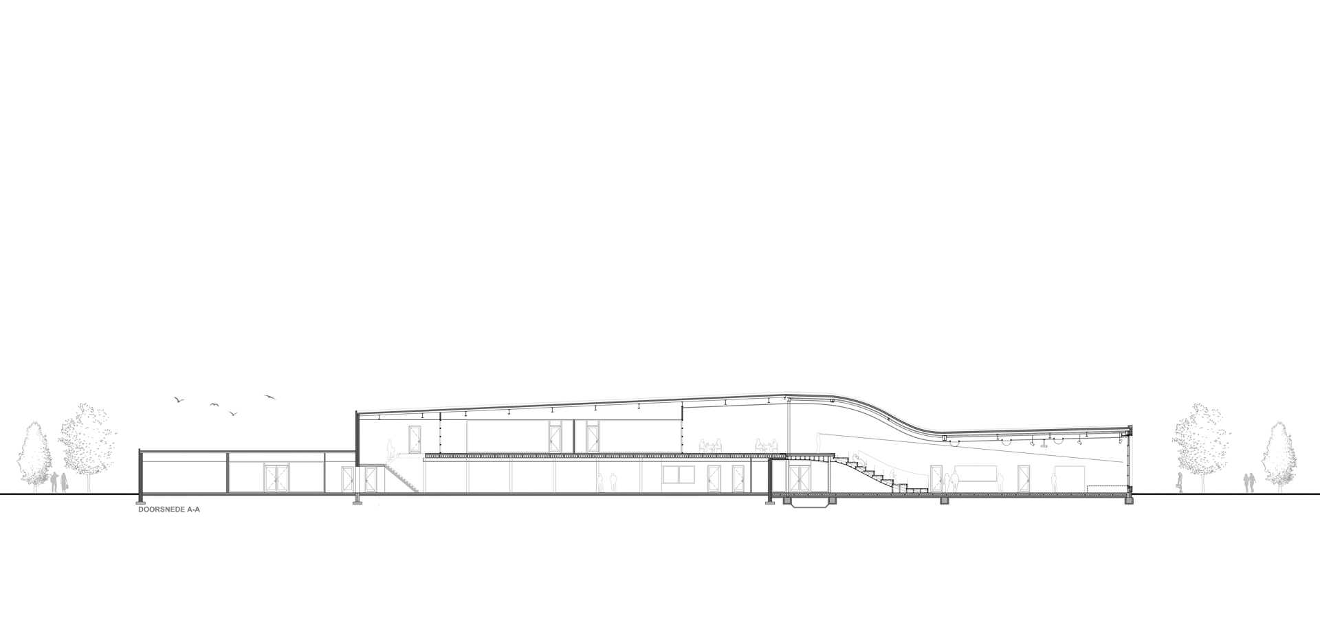
The architects have continued the existing roof and lowered it somewhat. This lower area is now home to a new auditorium with seating stands, a stage and a kitchen. The blue colour scheme and ceiling lights evoke the impression of a starry sky.


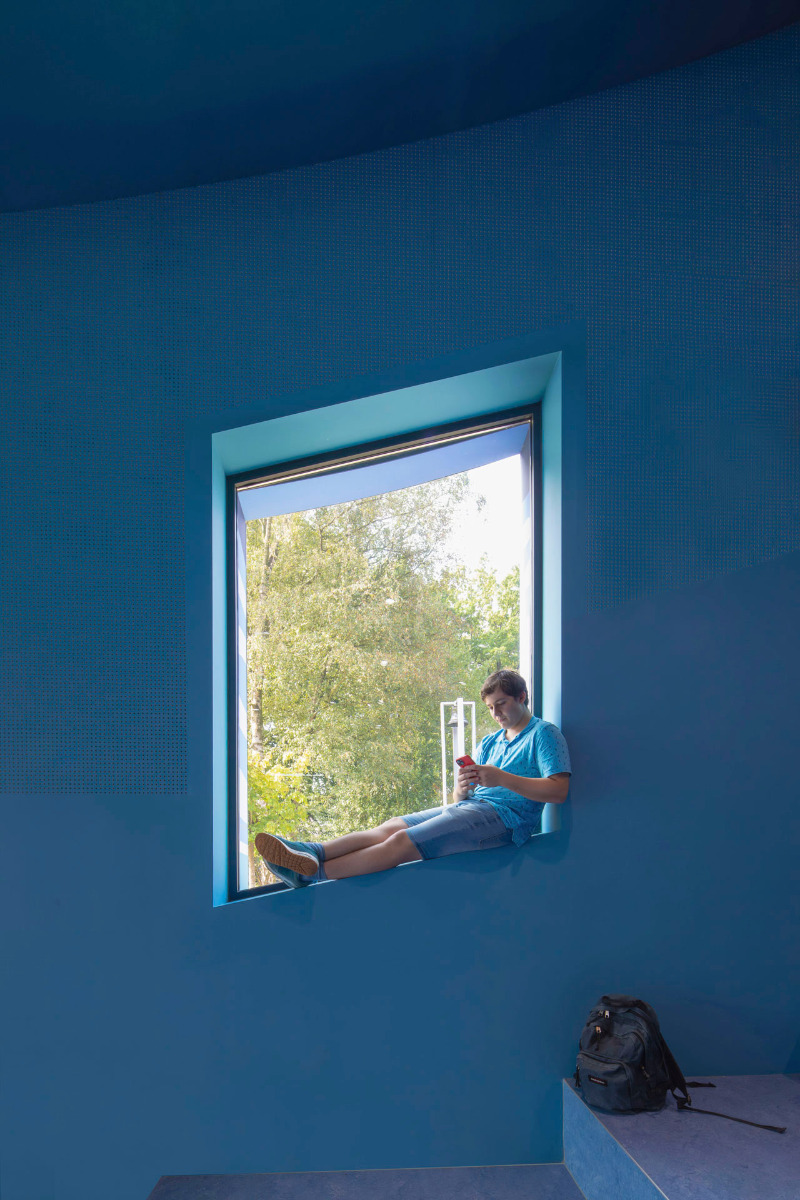
The curvy design of the expansion offers the best possible place for the tiered seating. The windows follow the curve to make a relaxed spatial ambience. © Daria Scagliola
Indoor access
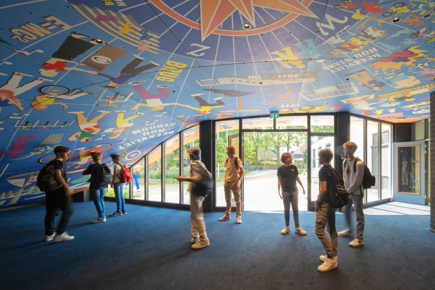
The lowered design of the new addition influences the flow of movement inside. A once poorly used corridor leads to the new auditorium and has integrated itself into the interior traffic. The main entrance remains in its original place – but is now beneath the new, curved roof.


More motifs bedeck the entrance area. They mark this zone as the transition from interior to outdoors. © Daria Scagliola
An informative facade
The facade design was developed in cooperation with renowned Canadian artist Ian Kirkpatrick. Motifs reflecting the memories of students and staff cover the walls in vivid colours. Above the main entrance, a mural tells the story of the school.


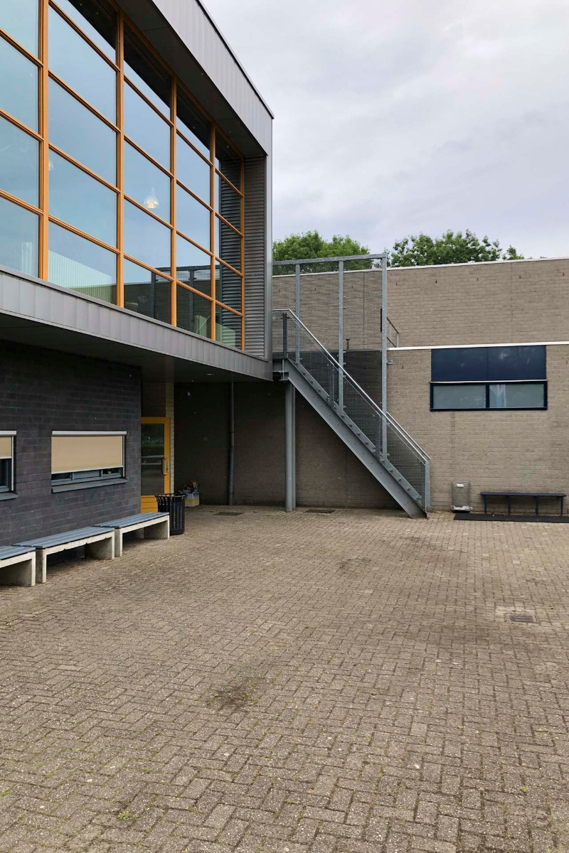
Over the course of the renovations, the large window at one end of the addition was moved and reused. © Daria Scagliola
Reuse
The design has reused elements from the original building. The large window that was over the entrance before the renovation has been painstakingly removed and reused at one end of the addition. It creates the impression that the window has slipped forwards and fallen onto the floor. With great creativity, the project members have made a unique, future-oriented place of learning that keeps its past in view.
Read more in Detail 3.2024 and in our databank Detail Inspiration.
Architecture: MVRDV
Client: OMO
Location: Beekvlietstraat 4, 5271 SM Sint-Michielsgestel (NL)
Associated studio: Van Boven Architecten
Contractor: Peters Bouw en Onderhoud
Project coordination: ICS Adviseurs
Structural engineering: Van de Laar
Buildings physics, acoustics: PBTA
Graphic design: Ian Kirkpatrick, Maartje Berendsen


