Thresholds and transitions
Hotel at East Side Gallery in Berlin

New branch of the Locke hotel chain in Berlin, © Nicholas Worley
Berlin‘s new branch of the Locke hotel chain lies directly by the East Side Gallery. Its interior offers an eclectic design inspired by its location as well as its history. The Locke at East Side Gallery features 176 suites on the banks of the Spree; there are also a restaurant, a cocktail bar, a co-working space and a rooftop fitness studio. The individual areas work together thanks to their interior design, a brainchild of the New York architecture studio Grzywinski+Pons.


Eclectic interior design, © Nicholas Worley
Liminal spaces
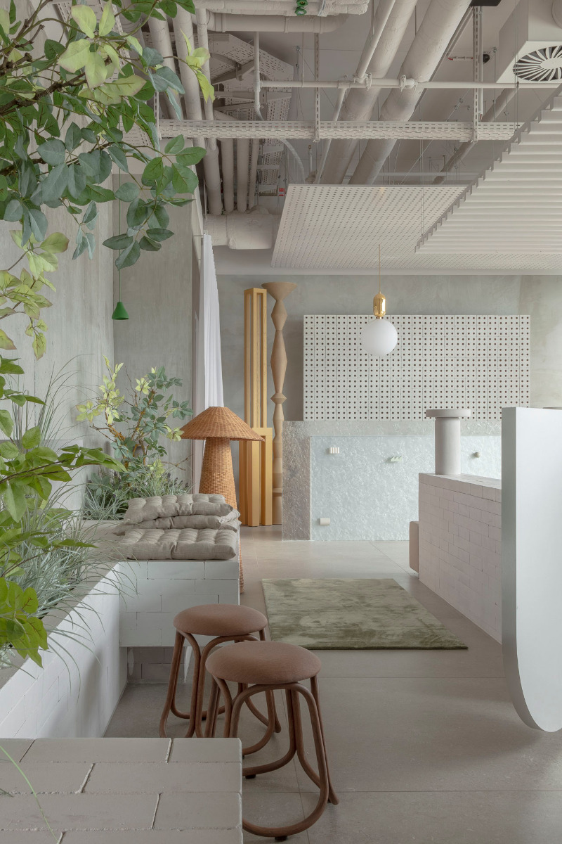
Inspired by the area’s past as the boundary between East and West, the architects worked with liminal or threshold spaces that aim to create various transitions. For instance, the ground floor acts as a sort of wall opening that makes the Spree accessible from the road. Along with the reception, it is home to the lounge, a café, a bar and working spaces.
Pastel-coloured furniture
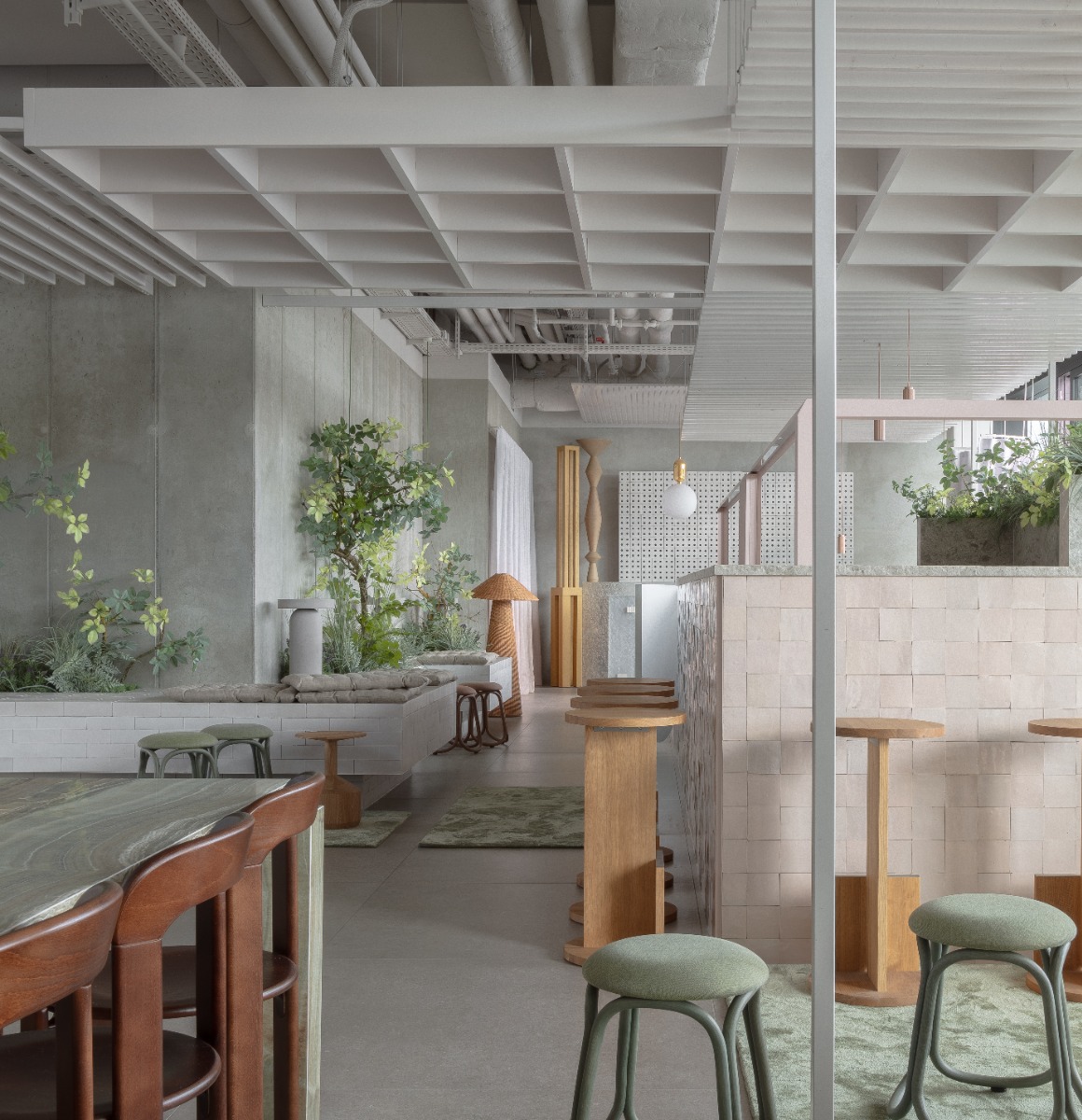
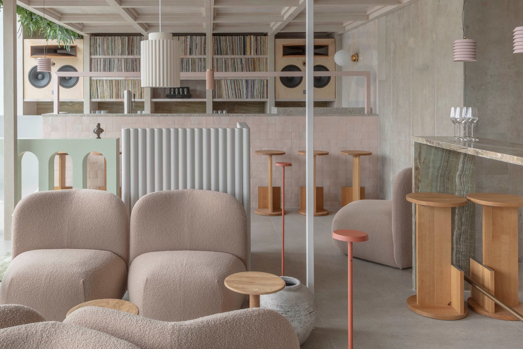
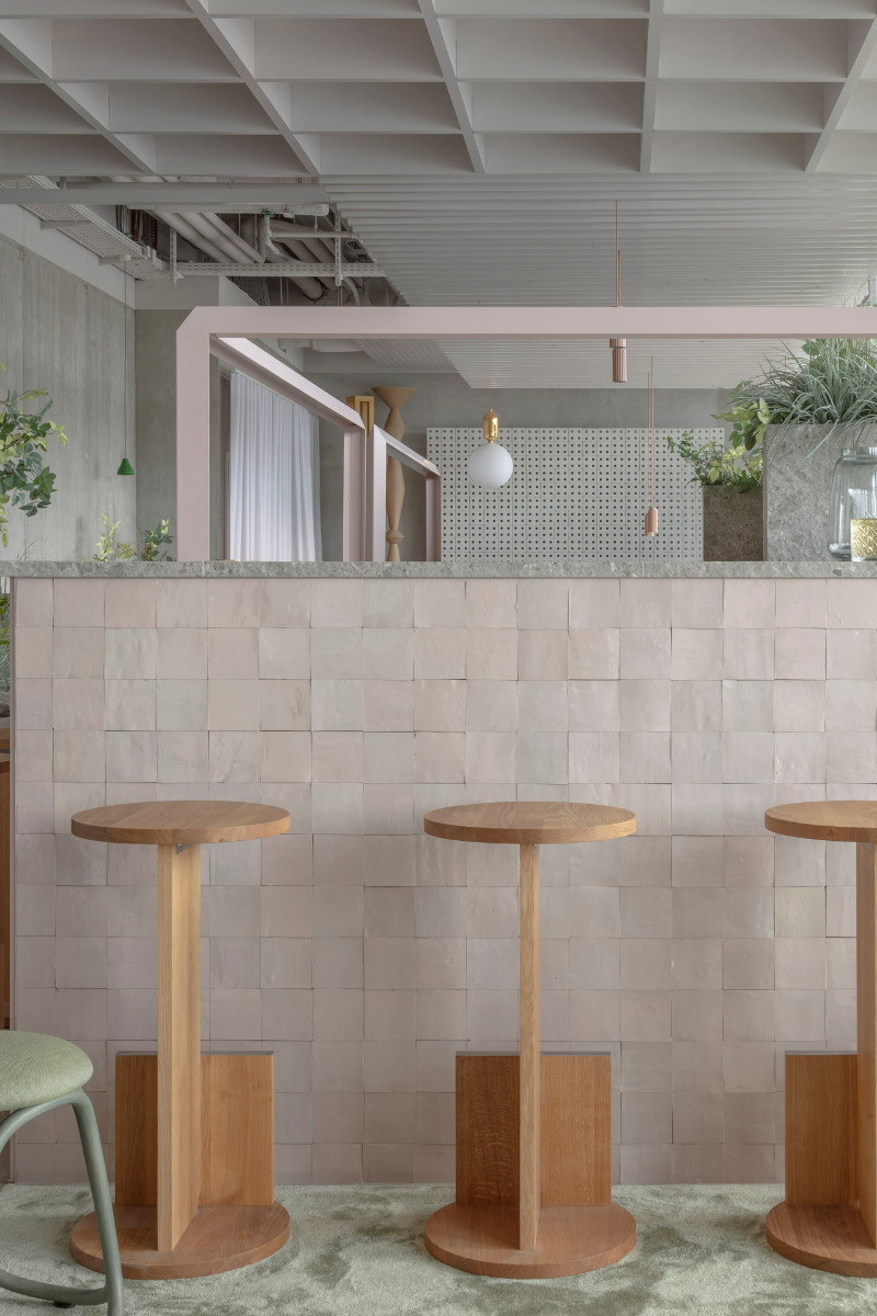
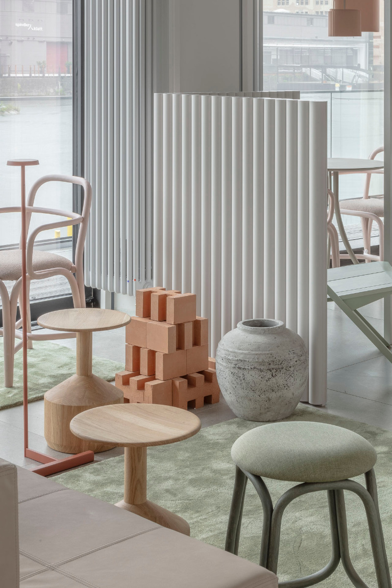
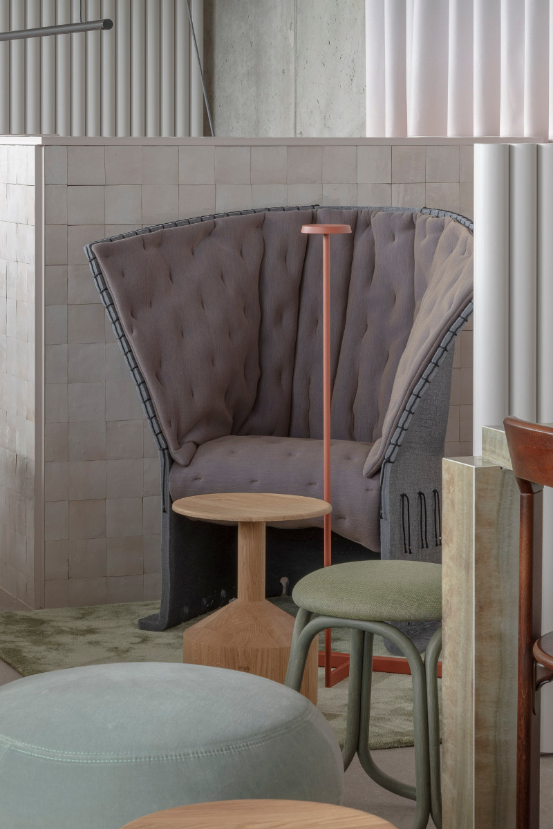
Surrounded by concrete walls and large glazed surfaces, the architects have placed pastel-coloured furniture around the space. Most of the white-painted technical installations are either exposed or, in some cases, covered with suspended ceiling panels of white-lacquered MDF in the form of slats or coffers. Indeed, the ground floor presents itself as a large spatial sculpture comprising a multiplicity of elements.


The lounge, café and bar at the Locke hotel branch in Berlin, © Nicholas Worley
Symbolic design
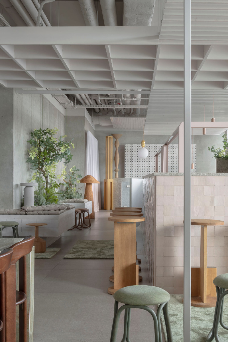
The positioning of the built-in seating, planters and architectural artefacts on the ground floor is charged with symbolic meaning. These elements consist in part of recycled local bricks. According to the architects, they are meant to evoke the Berlin Wall and its watchtowers.


Built-in seating and planters of recycled bricks evoke the Berlin Wall. © Nicholas Worley
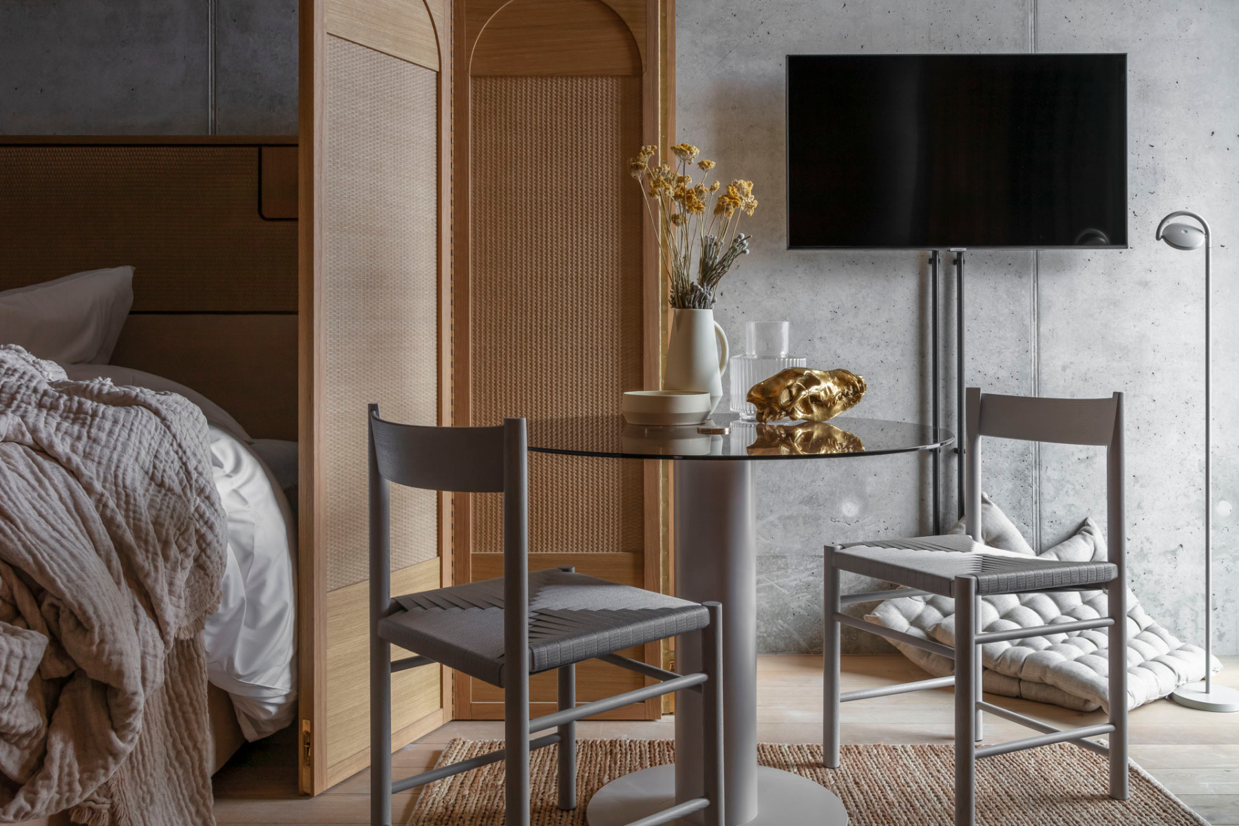
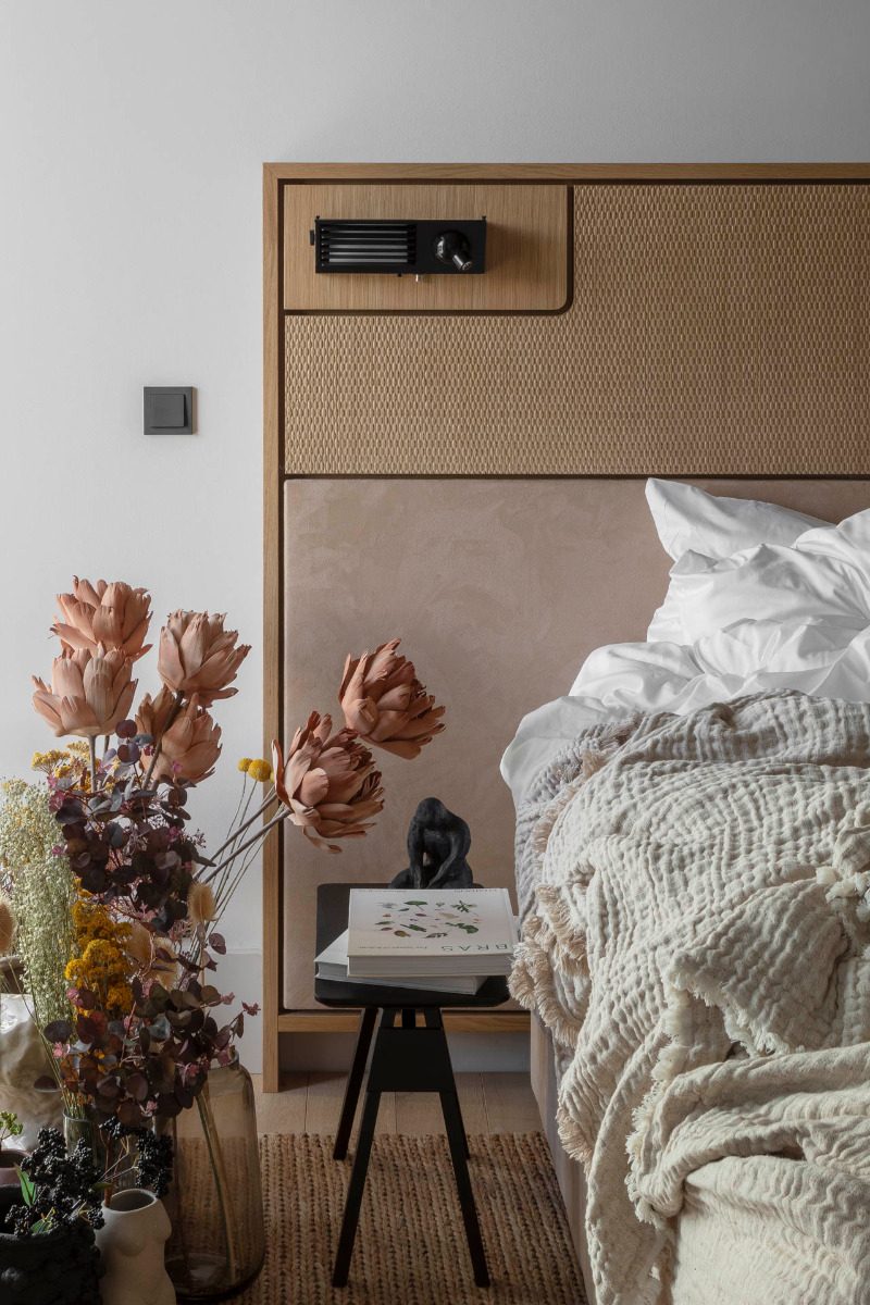
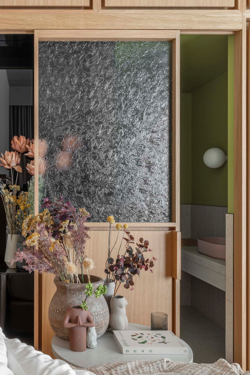
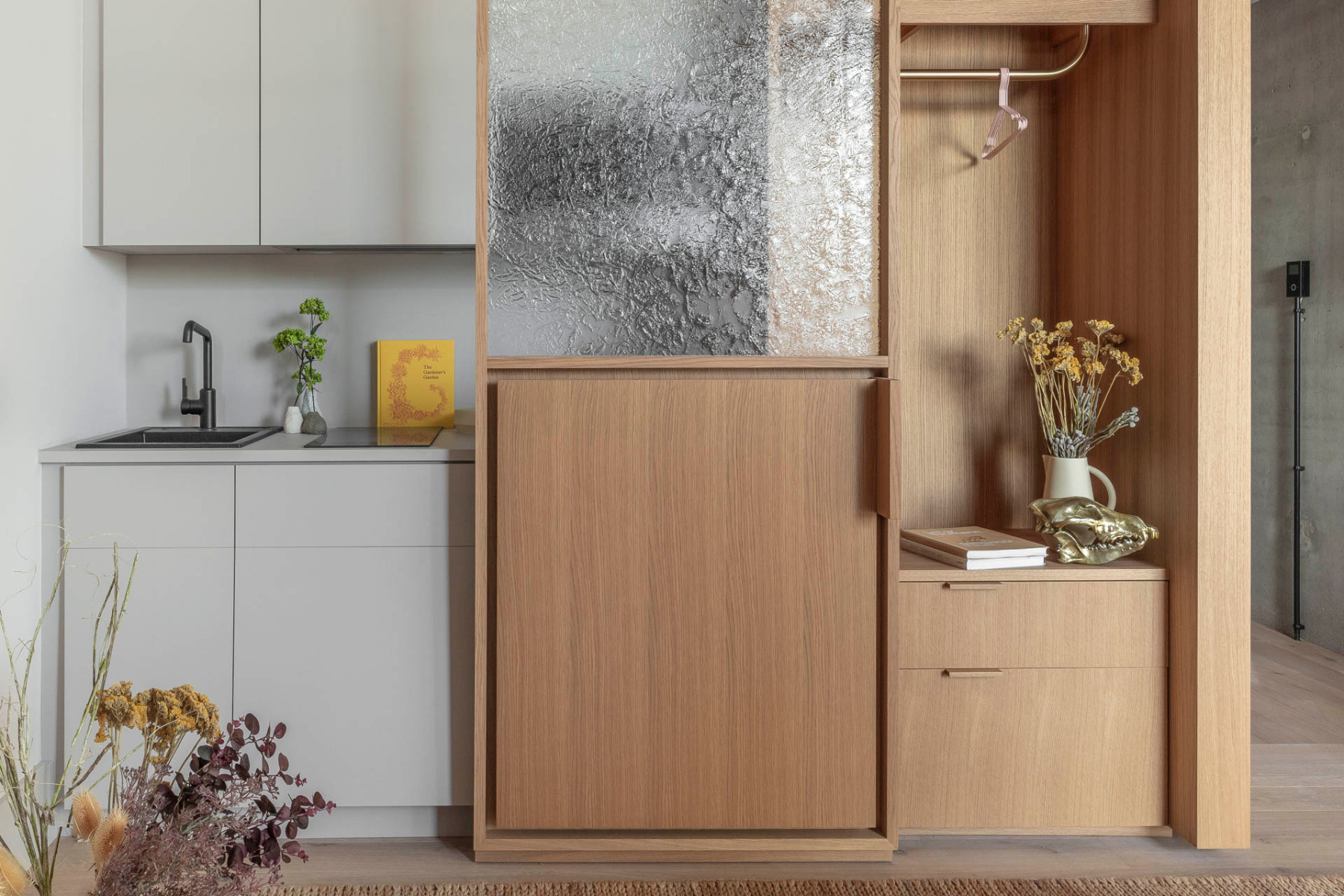
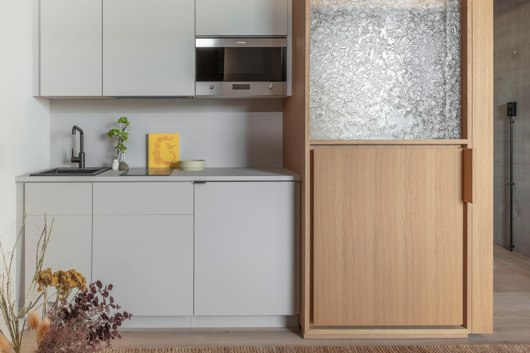
The suites are structured with oak-veneered fittings that accommodate the closet, a bedside table, the kitchen and bathroom. The latter space is entered via a sliding wall fitted with structural glass that represents a further threshold. Furthermore, the milky shimmer of the glass can be seen as a reference to the nearby Spree.


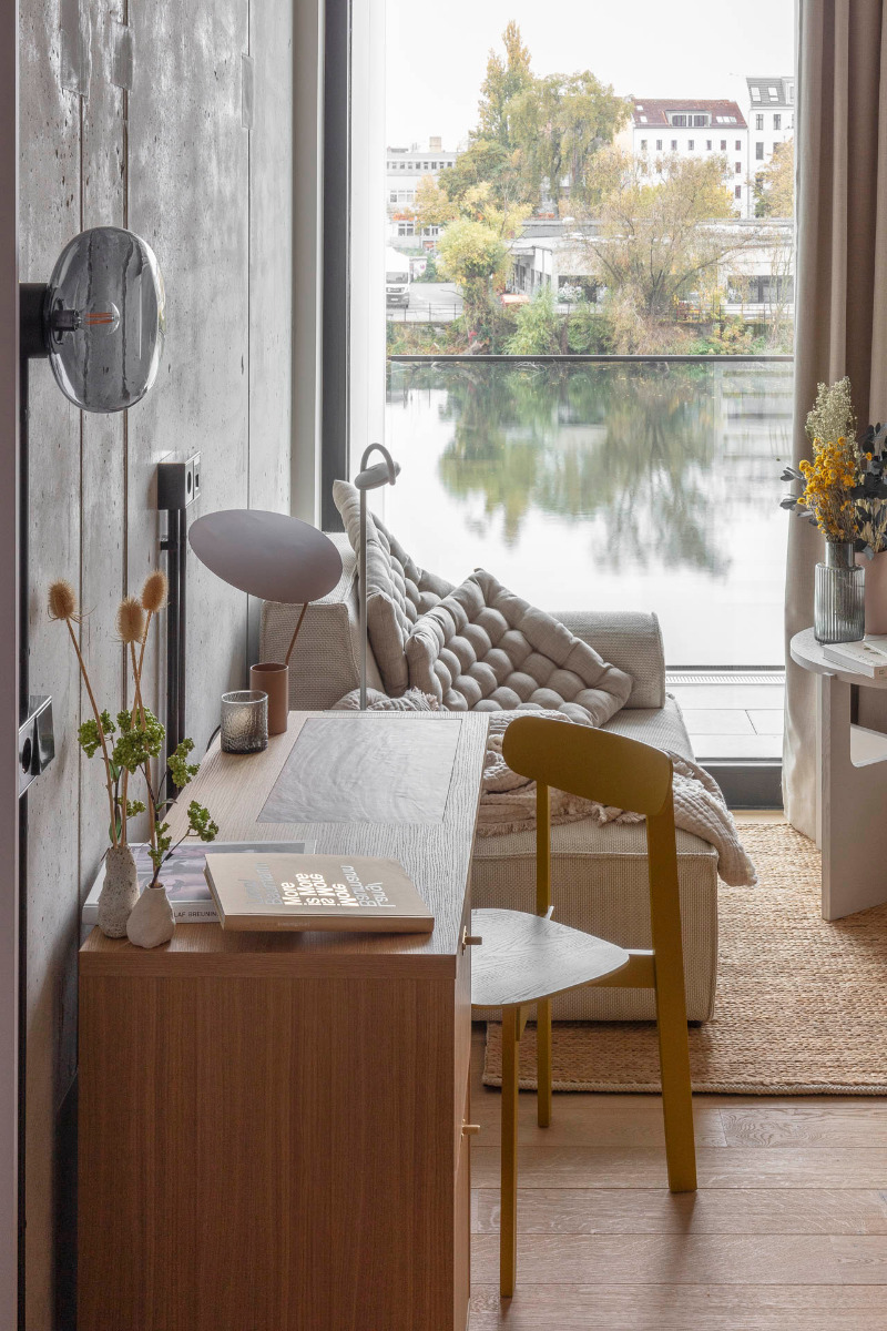
A look into a suite facing the Spree, © Nicholas Worley


In the suites, hard surfaces contrast with the soft materials of the furniture. © Nicholas Worley
Soft transitions
As on the ground floor, the walls and ceilings in the flats are of concrete. Instead of the grey-tiled floor, the suites have oak hardwood that creates a homey atmosphere. Moreover, the upholstered furniture and flowing curtains are colour-coordinated with the concrete. This connection between hard surfaces and soft furniture provides a further transition that fits consistently into the design concept behind the hotel.
Architecture: Grzywinski + Pons
Client: Locke
Location: Mühlenstraße 61-63, Berlin (DE)


