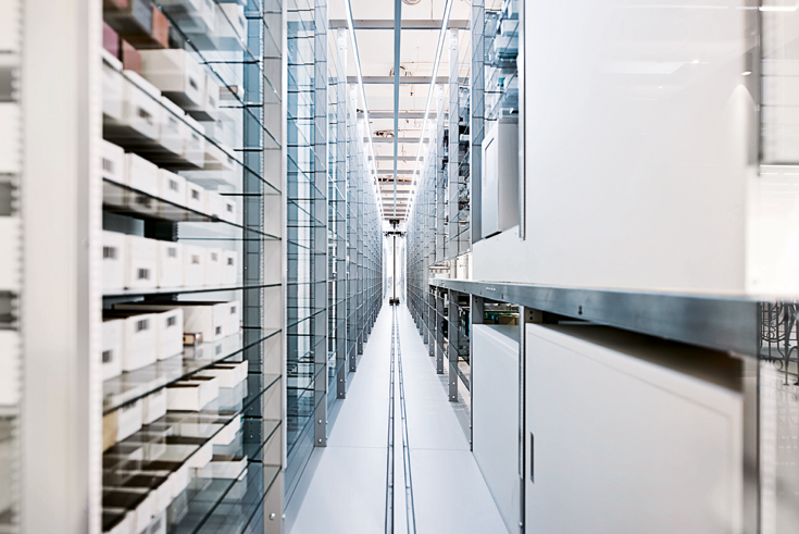
Fully Automatic: Warehouse System at the Au Pont Rouge Department Store

Photo: Cheungvogl
At the art-nouveau Au Pont Rouge department store, a comprehensive renovation program initiated in 2011 had every storey designed by a different architect. Over a sales area of 5,000 m², this store offers a combination of concepts concerning both spatial design and presentation as well as the range of brands and goods. Along with international top labels, up-and-coming designers display their works here. Au Pont Rouge is a shopping temple of leisurely strolling; it surprises visitors with its historical references and various scenographies set around the central atrium.
In contrast to the vividly coloured ground floor, the first upper level is all in white. Architects Judy Cheung and Christoph Vogl have created a fluid space linked by a sequence of translucent glass elements which softly filter the light. In the interplay of lightly reflective panes, white epoxy-resin flooring and ceiling coatings of expanded metal that looks like gossamer webbing, the boundaries of the room seem to dissolve. Like a veil, the frosted-glass walls along the façade fade out the city and create a relaxed atmosphere for the exclusive beauty area and changing pop-up stores that lie behind.
The architects have completed their redefinition of a shopping experience with a high-bay storage system in miniature: customers select their products via app or mobile phone and can then observe the fully automatic warehouse system through the glass as the goods are conveyed by grippers and belts to the cashier area. This frees the shopping areas themselves from sales and storage, giving them a certain flexibility.

