Maritime inspiration
The Docks Office Building in Frankfurt by Meixner Schlüter Wendt

© Lars Gruber
Lorem Ipsum: Zwischenüberschrift
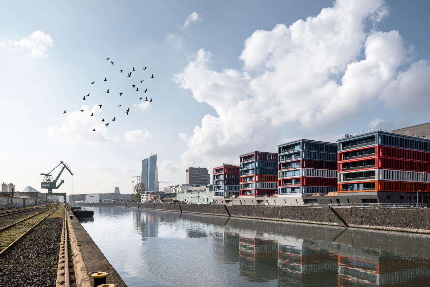
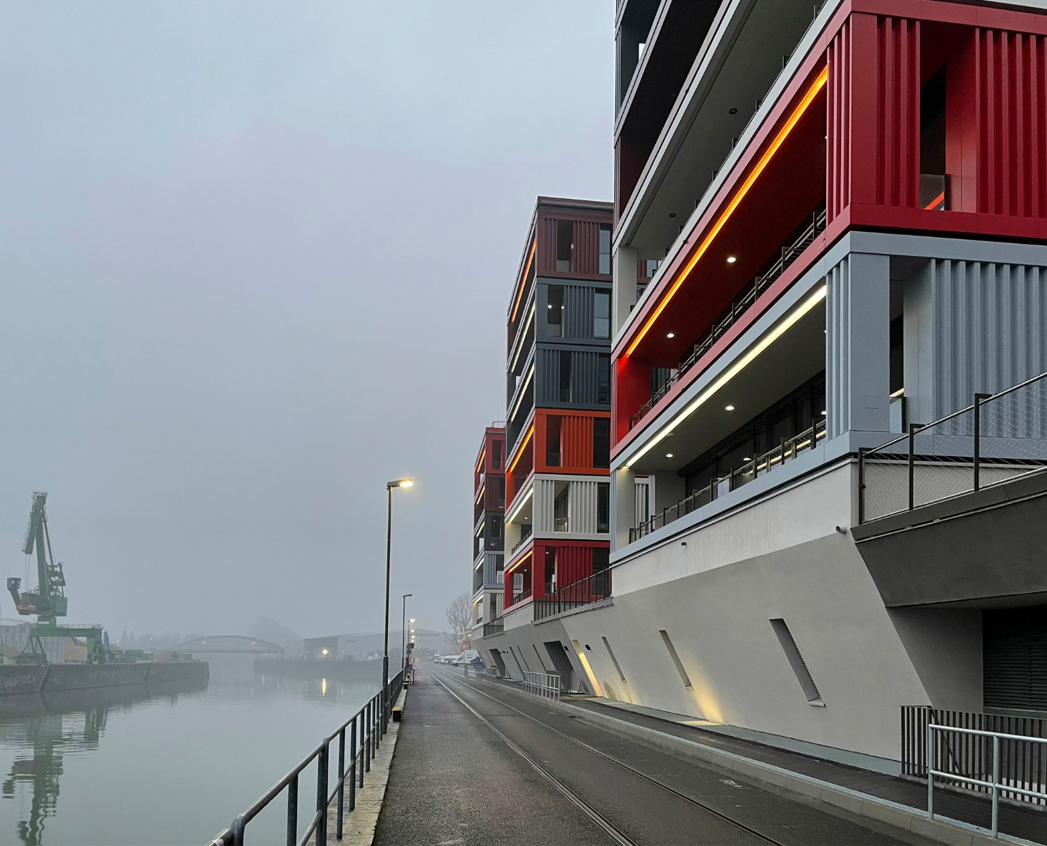
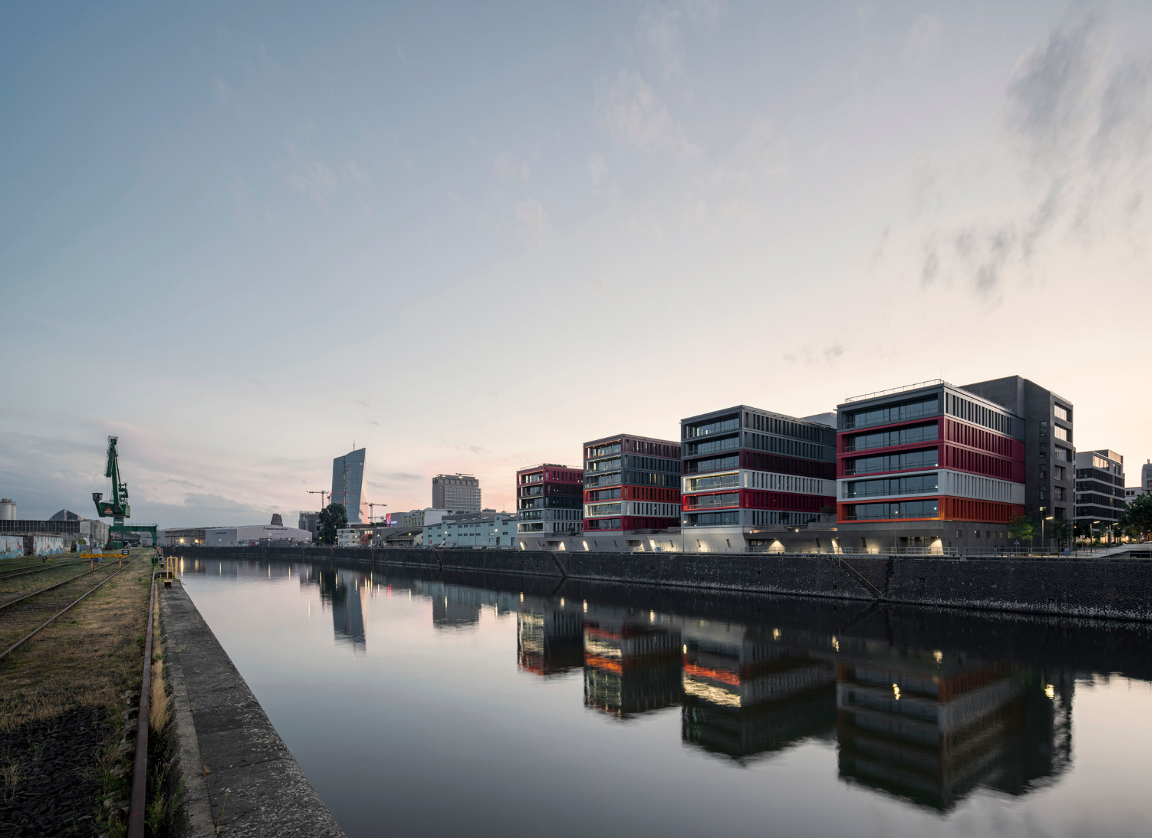
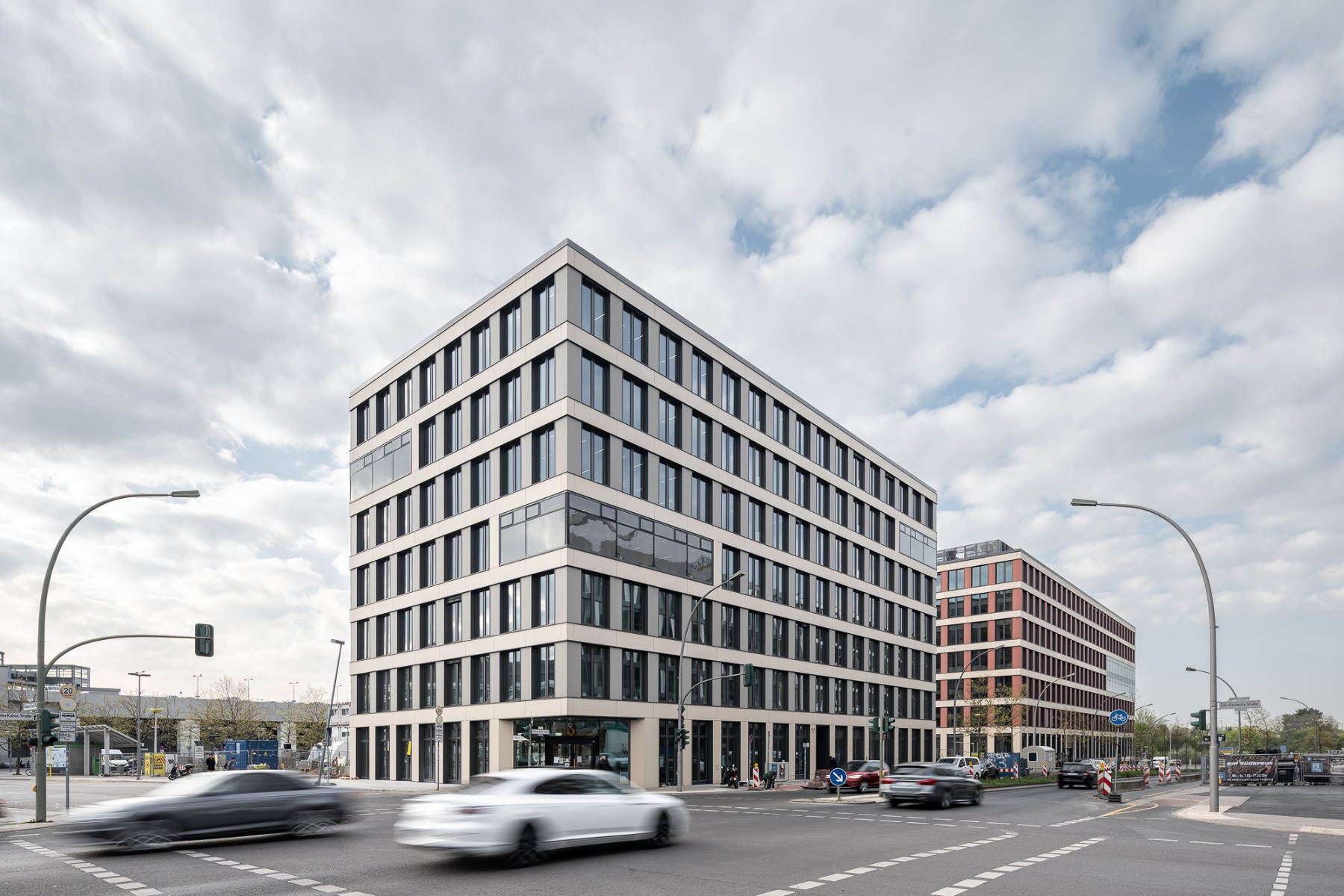
The Docks, an office building in Frankfurt's Osthafen port area, presents two very different faces to its surroundings: while the street front comes in sober white and grey, the waterside facade shows the inspiration of colourful stacks of shipping containers.


© Christoph Kraneburg
Lorem Ipsum: Zwischenüberschrift
As a project, The Docks goes back a long way – to 2012, when Meixner Schlüter Wendt completed the Dock 2.0 office building on the adjacent plot at the east. The building had a similar shipping container look even back then but at the east was clasped by a white slit-windowed facade ending at the top in a flat roof with a pergola, and in a high podium at the bottom.
Lorem Ipsum: Zwischenüberschrift
At the time, the architects described the Docks 2.0 design as follows: "The building rounds off the street spaces on the neighbourhood side with a calm, urban facade, whereas on the side facing the water it has the appearance of stacked shipping containers.


© Lars Gruber
Lorem Ipsum: Zwischenüberschrift
The transformation process and the abstraction of conventional container stacks are underscored by the fact that the container elements do not correspond to the standard dimensions and modular uniformity of ISO containers." As the architects also noted: "Like the custom-folded sheet metal ribs on the facade, the office windows consist of storey-height vertical elements. Horizontal and ribbed sheet metal elements mark the storey lines and form all the window sills."


© Lars Gruber
Lorem Ipsum: Zwischenüberschrift
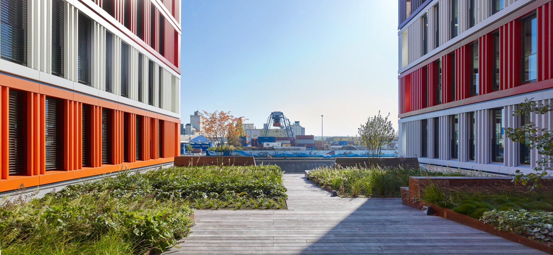
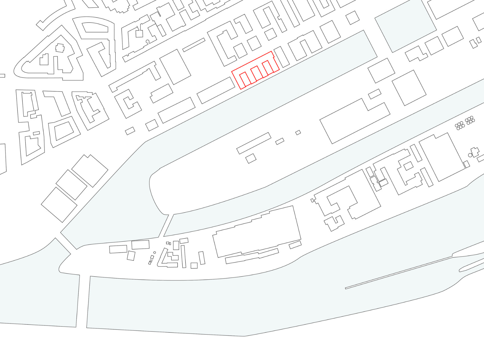
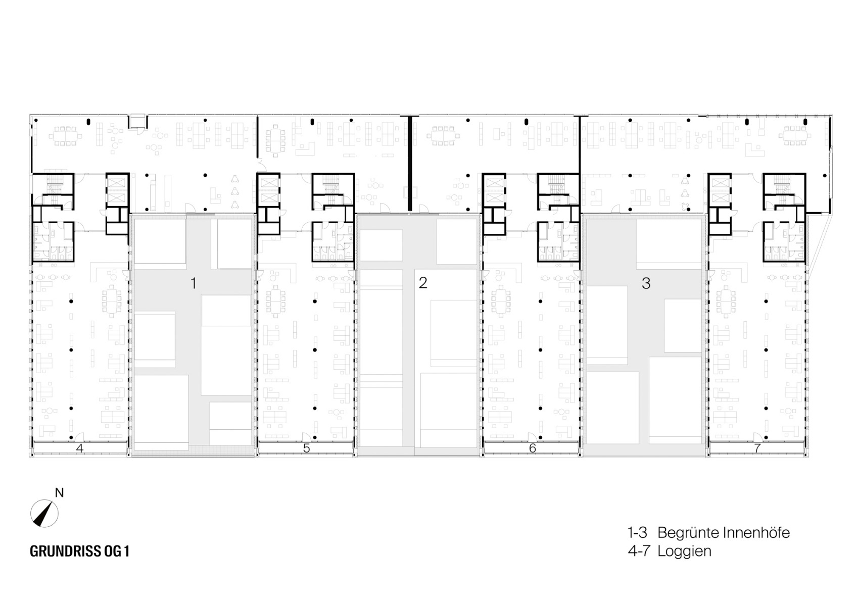
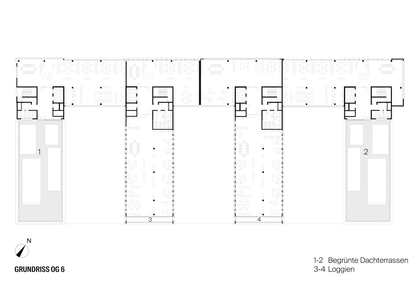
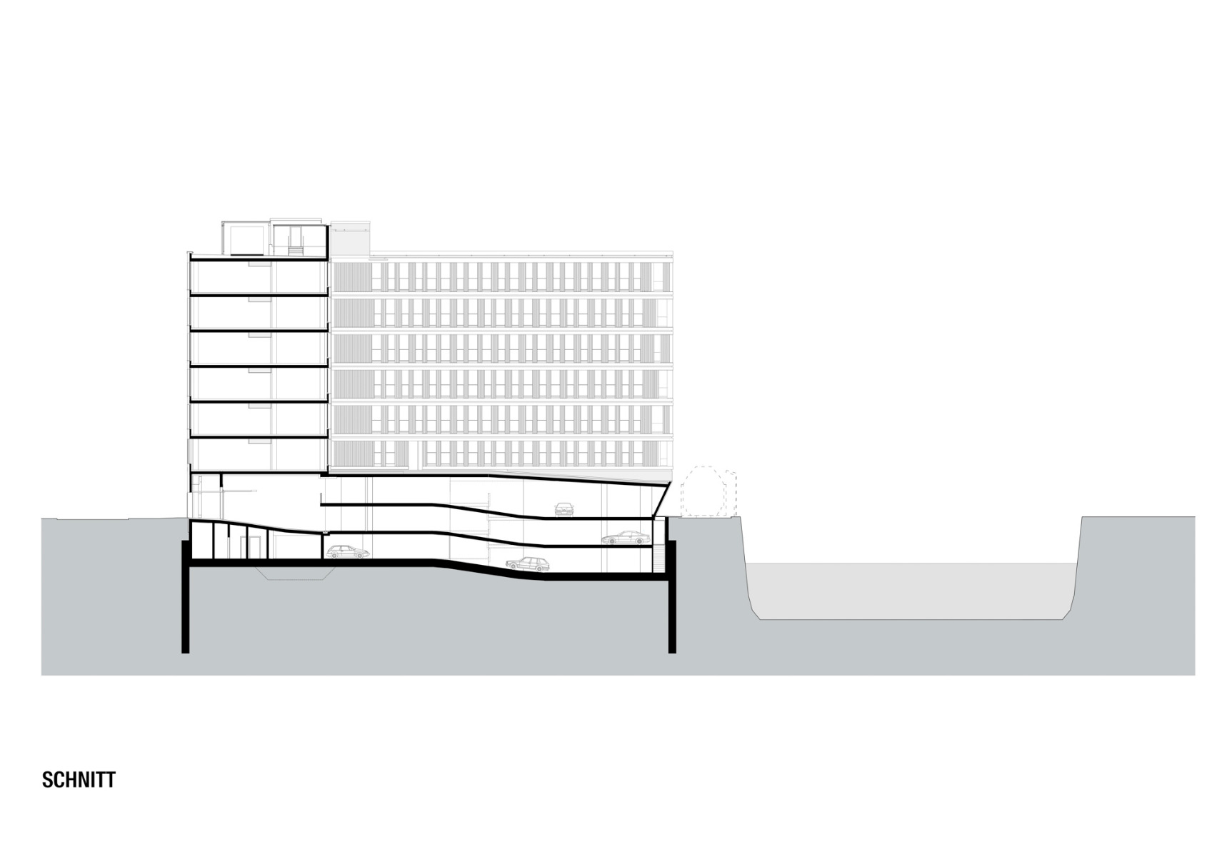
The design of The Docks takes a similar approach, but the podium zone is differently shaped and the dissimilarity between the waterside facade and the one facing dry land is somewhat more pronounced. The comb-like new-build turns its back on the street at the north with sculpted ribbon facades plastered in dark grey and white, while at the water's edge, office storeys in white, pale blue or red are "stacked" five or six high above a bastion-like podium level. Greened roof terraces on the highest roof and on lower sections of the building are available for the office users.


© Christoph Kraneburg
Lorem Ipsum: Zwischenüberschrift
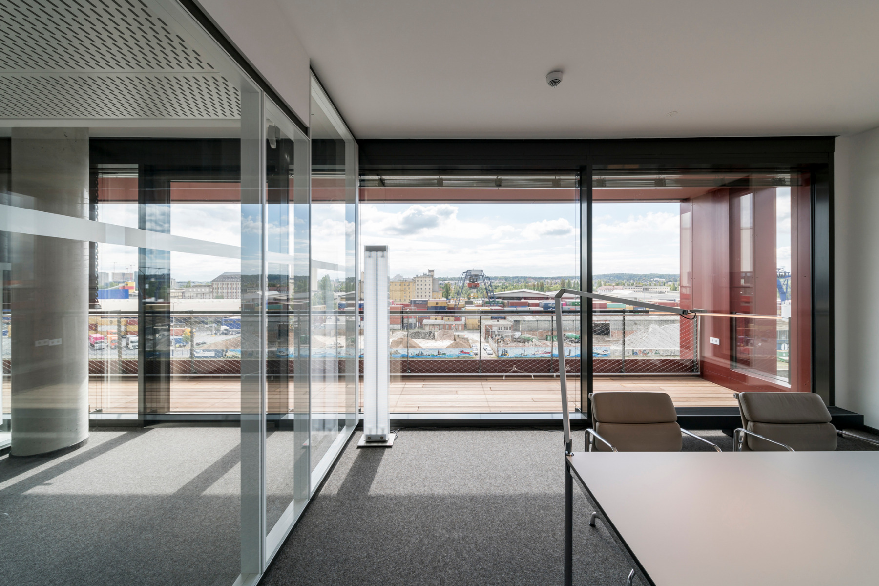
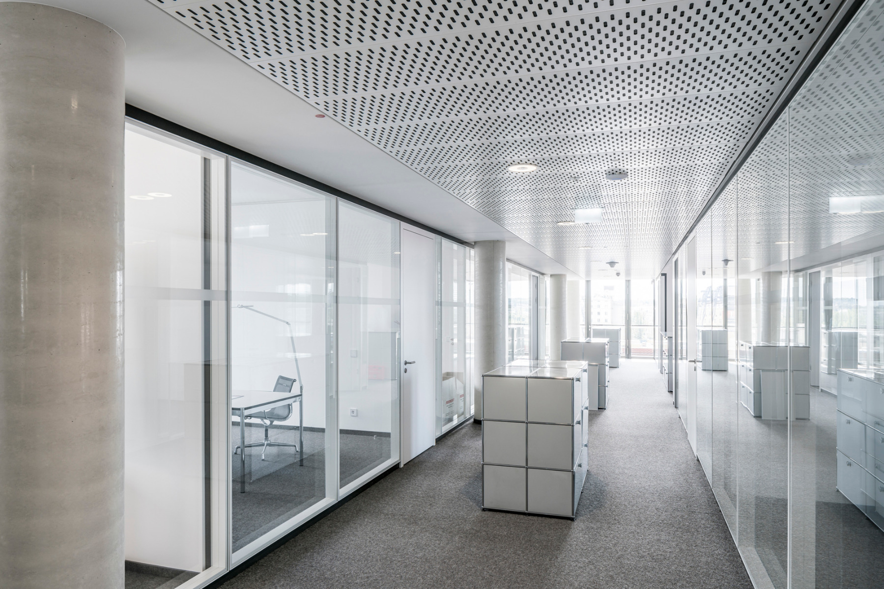
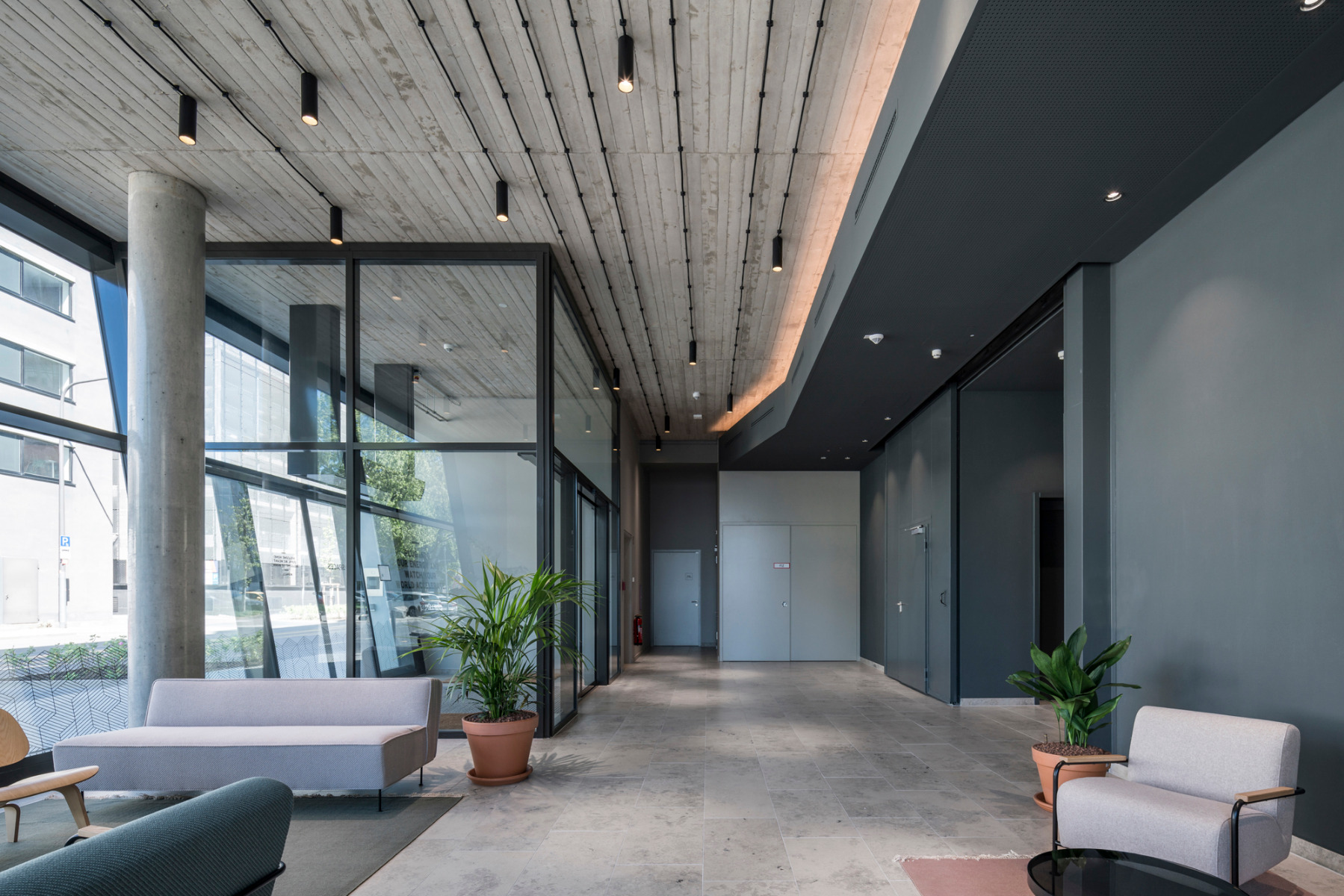
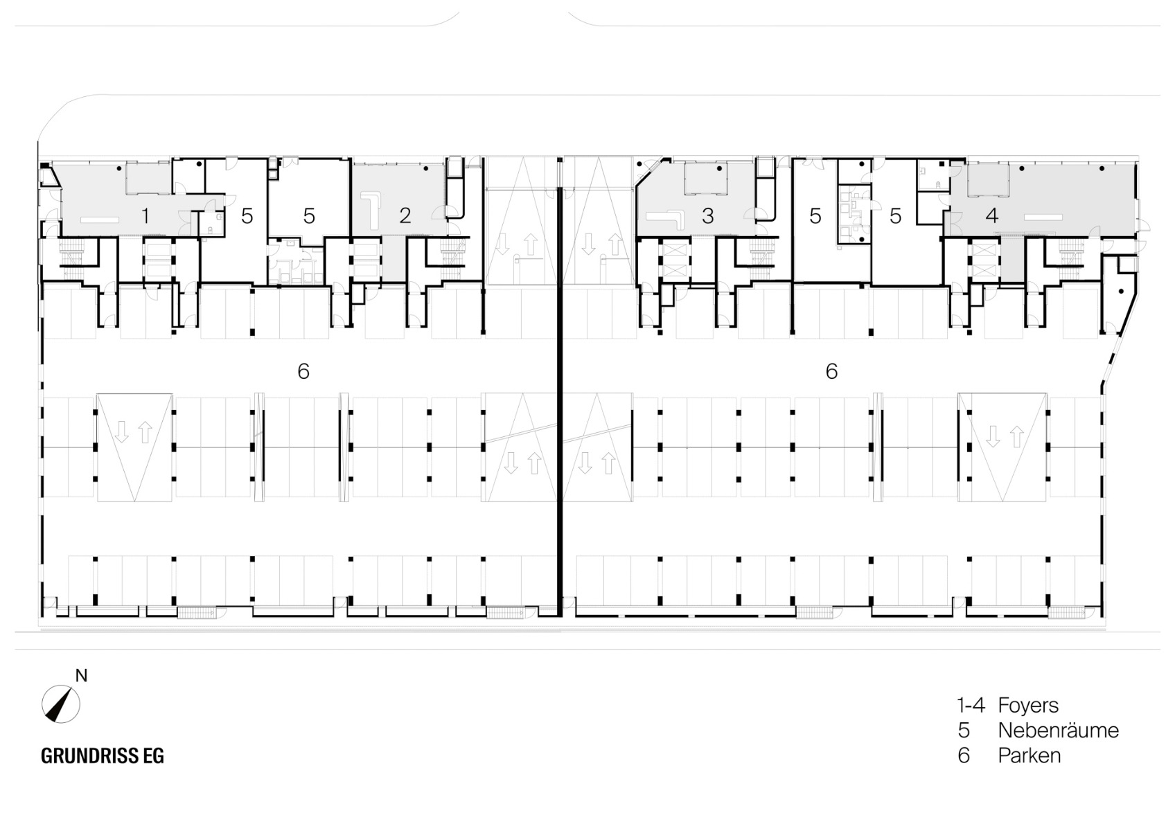
In the interior, high foyers on the street side of the building welcome employees and visitors alike. The office storeys are designed for furnishing either as open-plan work areas or as cubicle or group offices provided a central excess-width corridor. Whatever the case, the most coveted workspaces are likely to be those at the end of the office "fingers" with their unobstructable views of the Osthafen water.
Architecture: Meixner Schlüter Wendt Architekten
Client: Groß & Partner Grundstücksentwicklungsgesellschaft
Location: Lindleystraße 8a-d, 60314 Frankfurt (DE)
Gross floor area: 37 800 m²


