Chameleon effect
Station Mission in Hamburg by Carsten Roth

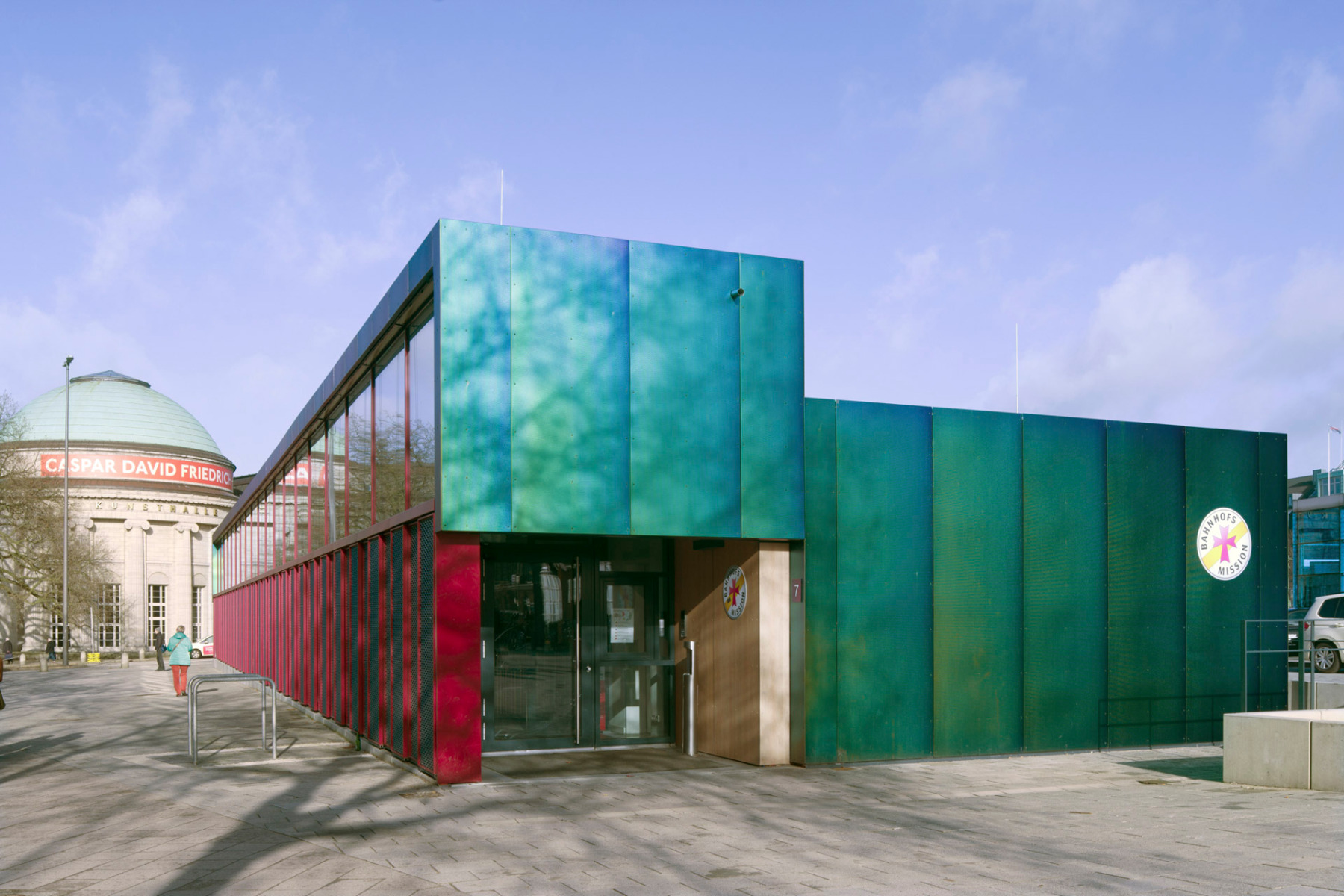
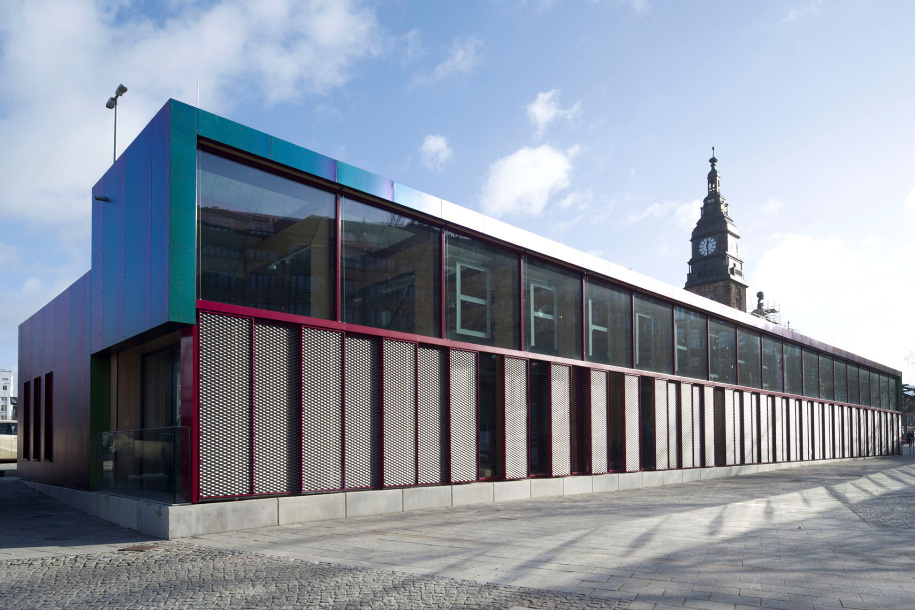
Both inside and out, the new station mission building is divided into two parts: The high, glazed access area to the street and the service rooms to the east. © Klaus Frahm
For many years, Hamburg's station mission was located inside the main railway station – until Deutsche Bahn decided to market the space more lucratively and relocated the social centre. The new location is not far to the north-west of the station concourse at a busy road junction. The spatial programme for the design was varied: a reception, a multi-functional event room, a quiet room, administration and support rooms as well as a hygiene centre were to be accommodated in an area of 400 m².
Making the work of the station mission visible
Carsten Roth and his office were originally only supposed to design a shell for this programme. In the end, they also completely redesigned the floor plan. “We were very impressed by the social work of the station mission, which is partly funded by donations from Hamburg residents – for example, they provide emergency treatment for people with care level 3 who are homeless and in wheelchairs! Our building is intended to honour this work, make it visible and provide a respectful place for the most needy in society,” say the architects, explaining the motivation behind their design.


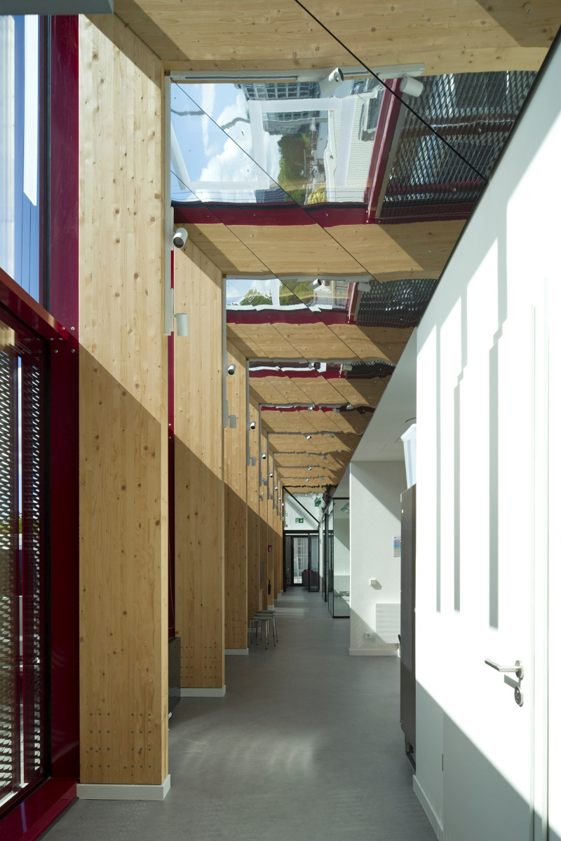
Mirrored ceilings line the 40-metre-long access corridor. © Klaus Frahm


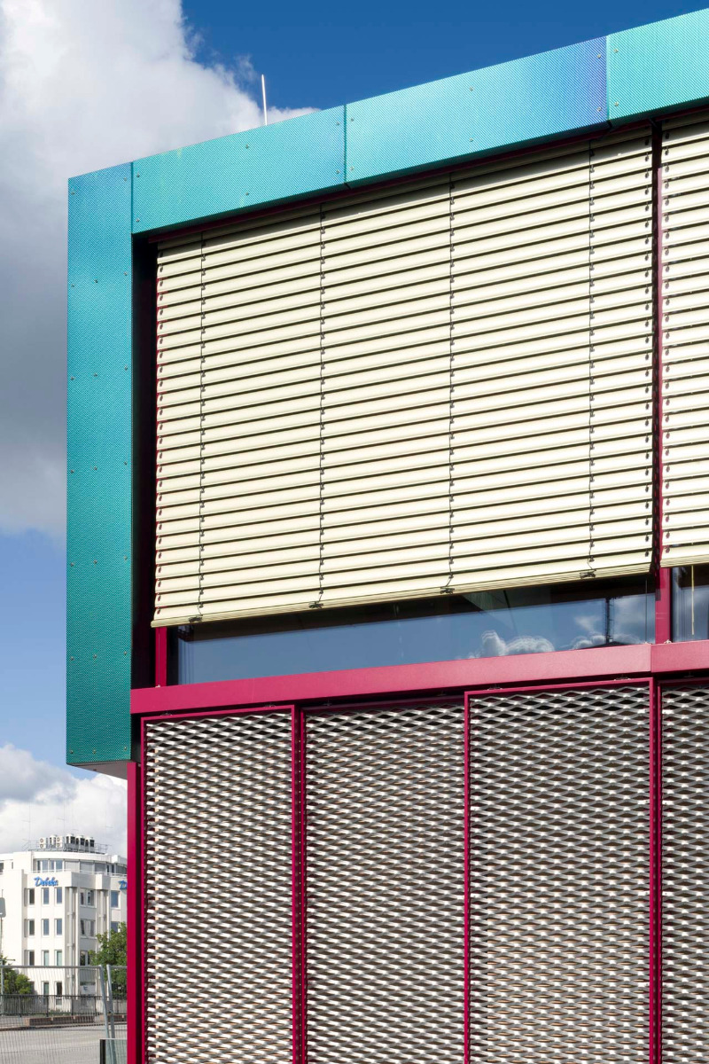
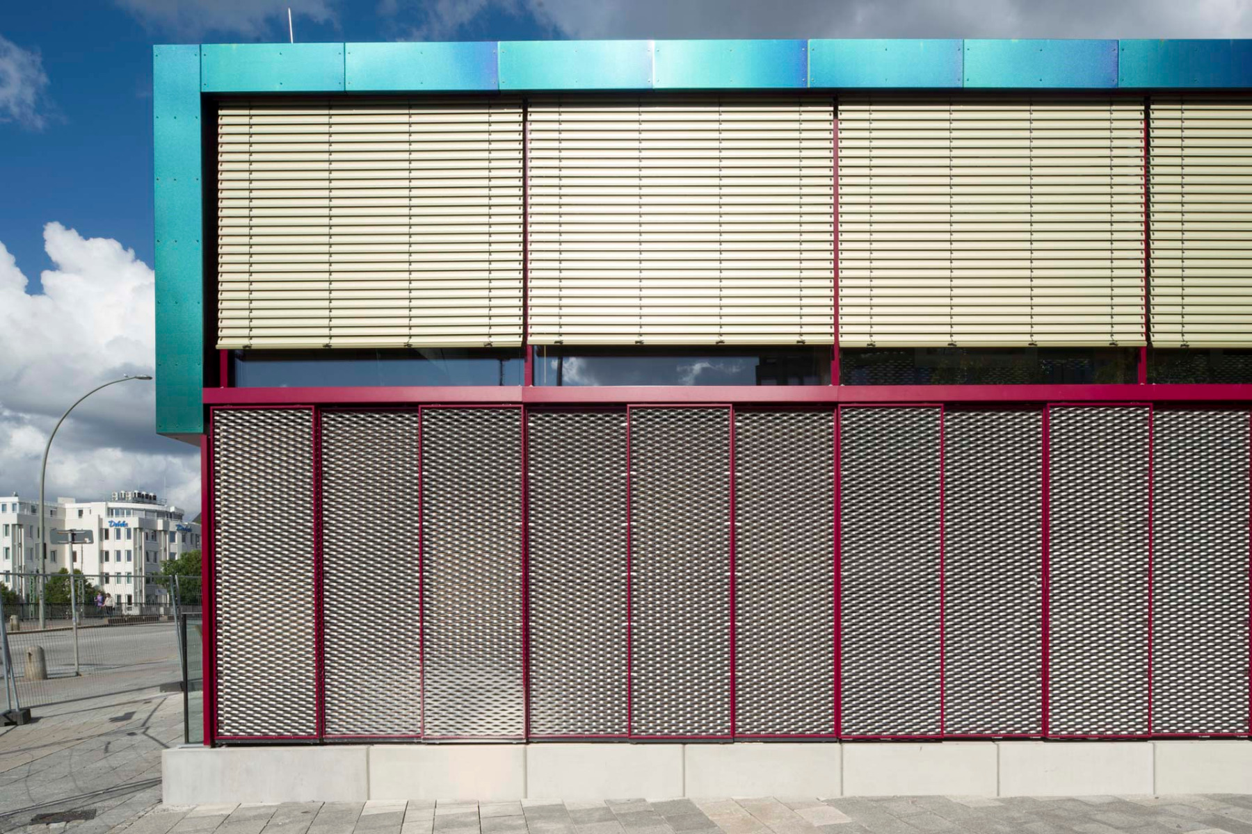
The lower part of the glass façade can be closed with expanded metal. © Klaus Frahm
Hall of mirrors behind the glass facade
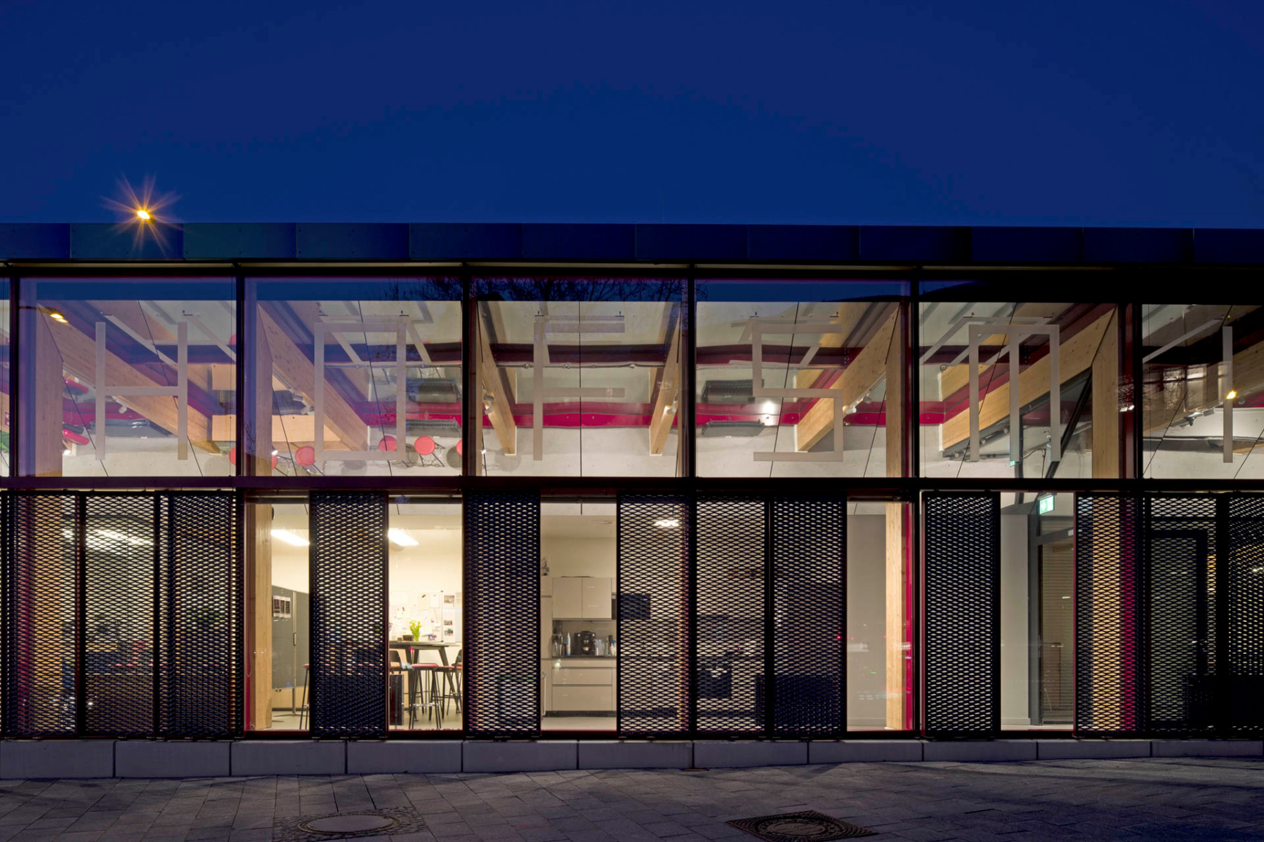
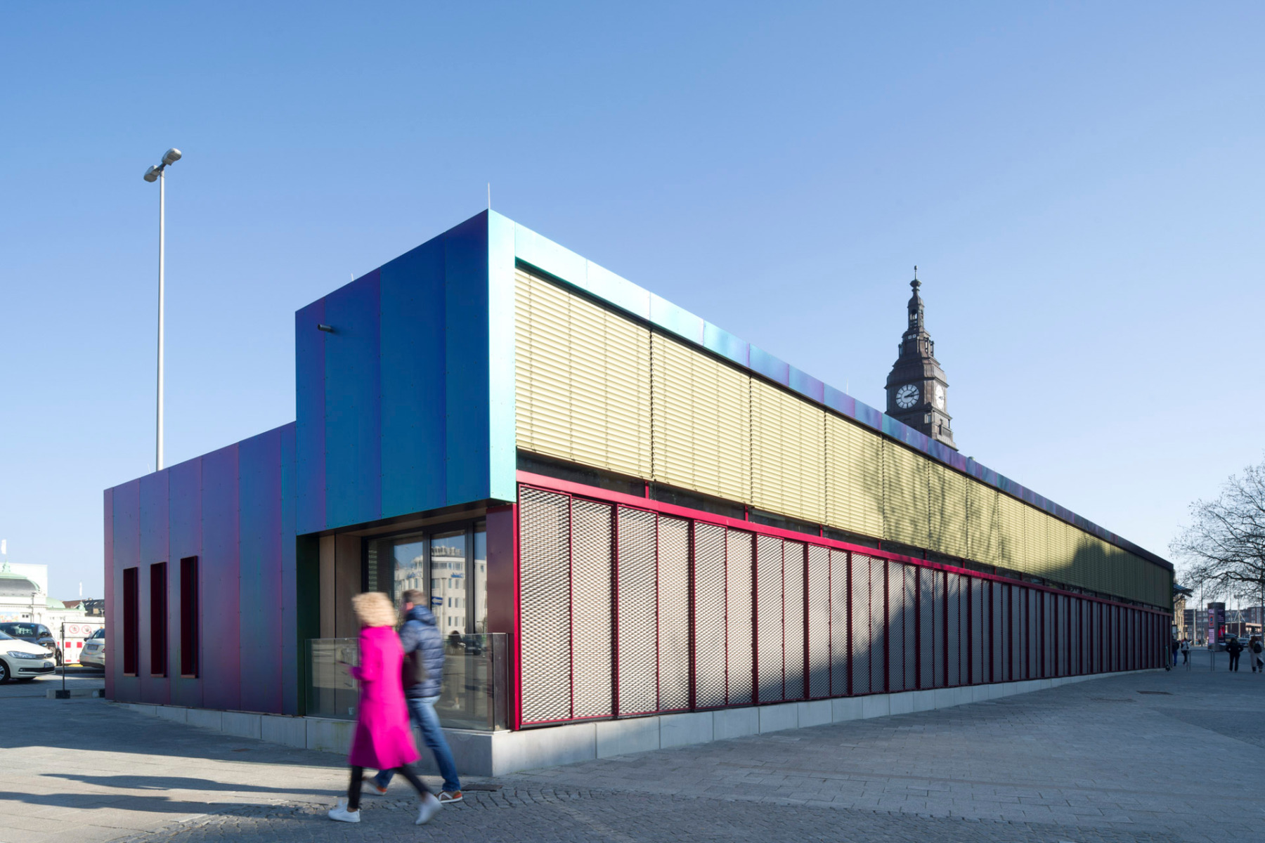
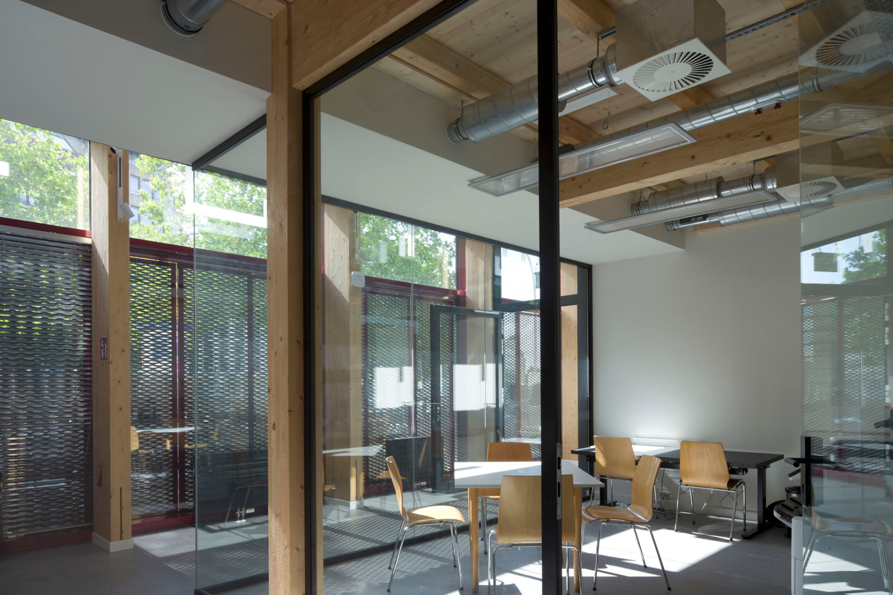
The 40-m-long building is divided lengthwise into two parts: a taller one with a one-and-a-half-storey transparent mullion-and-transom façade facing the street to the west, and a lower, more enclosed one to the east. Contrary to what one might expect, there is an access corridor behind the tall, open west side. At ground level, the façade can be closed with robust expanded metal sliding shutters. But even then, mirrors tilted at 45° in the upper façade allow a view into the building's interior – passers-by can see the building's employees going about their work upside down, so to speak.


In the dark, the mirrored ceilings and glass façade provide a deep insight into the building. © Klaus Frahm
Many facade colours at once
Protection against vandalism was also high on the list of priorities for the other façade surfaces. The architects chose a polyspectral stainless steel façade that shimmers between olive green, blue and red-violet depending on the viewing angle and sunlight – the first in reference to the copper roofs of the surrounding old buildings, the latter two being two of the station's CI colours. The panels are visibly bolted to the substructure from the outside and can be replaced individually. According to the architects, the otherwise unavoidable colour variations are irrelevant, as each panel has its own colour gradient anyway.
Architecture: Carsten Roth
Client: Deutsche Bahn InfraGO
Location: Steintorwall 20, 20095 Hamburg (DE)
General planning: iproplan Planungsgesellschaft
Structural engineering: Dittmann+Ingenieure Bauplanung
Building services engineering: Inros Lackner, Sweco
